

Anyway
Featured Anyway projects
This week's top Anyway projects, carefully handpicked by Visie's expert curators, showcase the best in style and innovation.
Anyway · Winter Cat
Winter Cat for the retail brand Anyway offers a masterclass in atmospheric visual storytelling, stripping away the frantic pace often associated with e-commerce platforms to champion a slower, more deliberate sense of domestic intimacy. Through a carefully curated lifestyle campaign, the project leans into a cozy and nostalgic aesthetic that feels refreshingly grounded. The visual narrative unfolds within a quiet interior, where the focus remains steadfast on the tactile warmth of the environment. By utilizing natural light as a primary narrative tool, the production captures the gentle dance of dust particles suspended in beams of sunshine, creating a texture that feels lived-in and authentic. The deliberate choice of live-action technique ensures that every detail, from the soft knit of a sock to the deep richness of red velvet upholstery, resonates with the viewer on a visceral level. Nick Haynes orchestrates this intimate sequence with a cinematic sensibility, transforming a simple domestic vignette into a compelling study of comfort. By eschewing conventional retail tropes in favor of this serene, light-drenched exploration, Anyway successfully bridges the gap between commercial messaging and genuine lifestyle appeal. It is a thoughtful execution that proves how high-end production values can elevate simple, everyday moments into a powerful, aspirational brand narrative, ultimately defining the mood of the season with clarity and grace.
 Project
 Anyway · Brand Identity
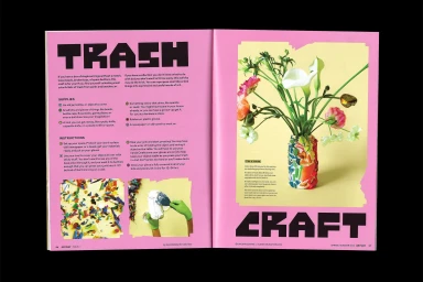
This brand identity project for Anyway presents a multifaceted visual language that spans editorial publication design and commercial product packaging. The creative direction relies on a bold typographic system, utilizing fluid, rounded letterforms and high-contrast, graphic layouts to anchor the brand's aesthetic. Developed by a collaborative team including Elizabeth Goodspeed, Daniel Carlsten, Emily Jing Sum Chan, Laura Campos, and Atipus, the project balances minimalist compositions with vibrant, punchy color palettes. Across the editorial spreads and promotional materials, the work leverages distinct techniques such as screen printing, intricate vector illustration, and layered graphic design to maintain a cohesive visual identity throughout diverse applications.
Explore other brands
Explore Visie’s leading industries, projects, and the talented creatives representing them.





