

Antwerp Art
Featured Antwerp Art projects
This week's top Antwerp Art projects, carefully handpicked by Visie's expert curators, showcase the best in style and innovation.
 Project
 Antwerp Art · Brand Identity
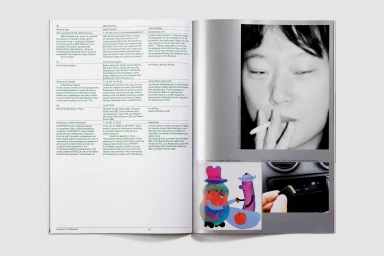
Antwerp Art presents a masterclass in cohesive visual language through its sophisticated brand identity for the Antwerp Art Weekend. Moving beyond the constraints of traditional marketing, the project establishes a rigorous design system that translates seamlessly from large-scale urban signage to intimate printed editorial spreads. The agency Vrints-Kolsteren anchors the visual narrative in a deliberate palette of deep forest green, soft pink, and muted grey, utilizing high-contrast geometry and sharp diagonal lines to create a sense of structural dynamism. This minimalist approach leans into the intersection of art and urban architecture, where bold typography serves as both information and decoration across diverse physical touchpoints. From the tactile materiality of a branded canvas tote to the distortion of light captured in macro abstract photography, the identity remains consistent yet adaptable. The work channels a refined aesthetic, evidenced by the clean sans-serif layouts and deliberate color blocking that unify everything from street-level billboard placements to detailed event guides. By prioritizing clear typographic hierarchy and structural rigor, the brand identity elevates the event beyond a mere schedule, positioning it as a cohesive cultural experience. This execution highlights how thoughtful graphic design can transform city-wide collateral into a unified art object, demonstrating a highly effective command of space, texture, and visual rhythm that remains sharp in any application.
 Project
 Antwerp Art · Brand Identity
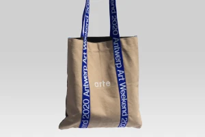
For the Antwerp Art Weekend 2020, the creative duo Vrints-Kolsteren developed a striking brand identity that masterfully translates the energy of a contemporary cultural festival into a cohesive visual language. Moving away from traditional event collateral, the project leans into a rigorous application of geometric minimalism, utilizing a sophisticated color palette of deep royal blue, warm earthy brown, and neutral beige to establish an immediate, recognizable presence. The design relies heavily on stark color blocking and precise typography, which appears consistently across diverse touchpoints ranging from utilitarian canvas tote bags and event booklets to large-scale outdoor advertising posters. By employing sharp, sans-serif typefaces and intentional negative space, the studio ensures that the branding remains highly readable while functioning as an artistic statement in its own right. The inclusion of subtle diagonal lines throughout the graphic system introduces a sense of kinetic movement, elevating the printed materials from simple information carriers to immersive design objects. Each element, from the stacked business cards to the bus shelter placements, benefits from deliberate composition and clean spatial organization. This project exemplifies how intentional, modern commercial design can serve as the backbone for a large-scale public event, turning essential event logistics into a bold, unified aesthetic experience that speaks directly to a design-conscious audience.
Explore other brands
Explore Visie’s leading industries, projects, and the talented creatives representing them.





