
Antwerp Art: Brand Identity
Jun 2020
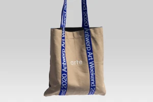
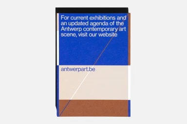
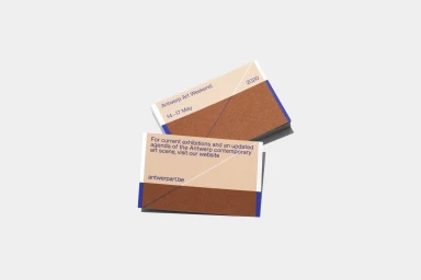
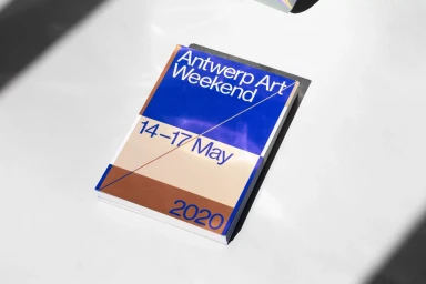
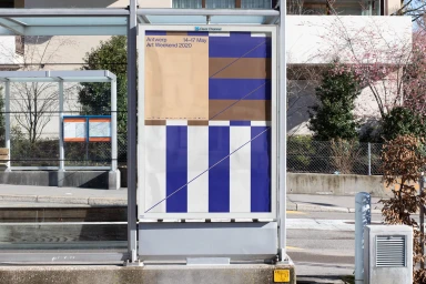
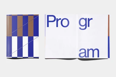
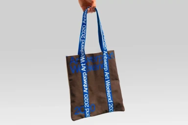
For the Antwerp Art Weekend 2020, the creative duo Vrints-Kolsteren developed a striking brand identity that masterfully translates the energy of a contemporary cultural festival into a cohesive visual language. Moving away from traditional event collateral, the project leans into a rigorous application of geometric minimalism, utilizing a sophisticated color palette of deep royal blue, warm earthy brown, and neutral beige to establish an immediate, recognizable presence. The design relies heavily on stark color blocking and precise typography, which appears consistently across diverse touchpoints ranging from utilitarian canvas tote bags and event booklets to large-scale outdoor advertising posters. By employing sharp, sans-serif typefaces and intentional negative space, the studio ensures that the branding remains highly readable while functioning as an artistic statement in its own right. The inclusion of subtle diagonal lines throughout the graphic system introduces a sense of kinetic movement, elevating the printed materials from simple information carriers to immersive design objects. Each element, from the stacked business cards to the bus shelter placements, benefits from deliberate composition and clean spatial organization. This project exemplifies how intentional, modern commercial design can serve as the backbone for a large-scale public event, turning essential event logistics into a bold, unified aesthetic experience that speaks directly to a design-conscious audience.
Commercial, Clean, Minimalist, Horizontal
Typography
White Seamless
