

MAP
Featured MAP projects
This week's top MAP projects, carefully handpicked by Visie's expert curators, showcase the best in style and innovation.
 Project
 MAP · Brand Identity
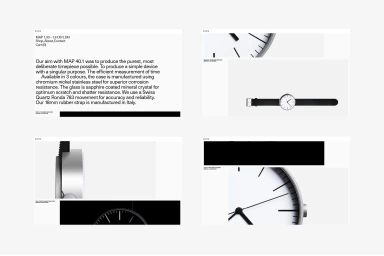
The brand identity for MAP represents a masterclass in editorial minimalism, channeling a technical aesthetic that prioritizes precision and understated geometry. Through a cohesive visual language, the project employs a sophisticated grid system that leans into modern, clean-lined design principles. The identity is anchored by bold, sans-serif typography, which functions as the primary visual engine across various touchpoints, from digital web interfaces to tactile stationery. By utilizing high-contrast compositions and a restricted palette of black and white, the design effectively highlights the deliberate, singular nature of the brand’s horological offerings. Techniques such as macro photography and high-key lighting are utilized to emphasize the construction of the stainless steel casings and the textures of Italian-manufactured straps, while soft, even natural light lends an approachable yet professional polish to the product presentation. Whether through the rhythmic arrangement of recycled packaging or the abstract precision of vector-based digital post templates, the work maintains a rigorous focus on clarity and structure. This corporate project, executed with graphic design contributions from Adding, successfully translates a complex, modern industrial philosophy into a clear and memorable visual system that feels both functional and timeless. The result is a refined brand identity that speaks to a discerning audience through a balanced combination of technical rigor and contemporary graphic simplicity.
 Project
 MAP · Brand Identity
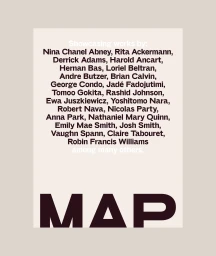
The brand identity for MAP, designed by Praline, establishes a visual language centered on modernist graphic principles and precise typography. The work spans a comprehensive range of touchpoints, from digital interface design and web layouts to stationery and environmental outdoor advertising. Each application adheres to a clean, minimalist aesthetic, prioritizing balanced spatial arrangement and bold, impactful type treatments. Across the campaign, the identity integrates vibrant, painterly illustrations and expressive abstract backgrounds, bridging contemporary digital design with a sophisticated artistic sensibility. Whether applied to large-scale billboards in urban environments or tactile print collateral like canvas tote bags and business cards, the system maintains visual cohesion through consistent typographic hierarchy and structural clarity.
Explore other brands
Explore Visie’s leading industries, projects, and the talented creatives representing them.





