
MAP: Brand Identity
Nov 2023
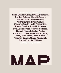
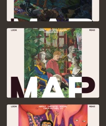
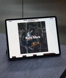
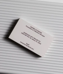
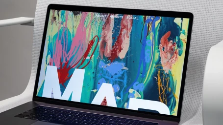
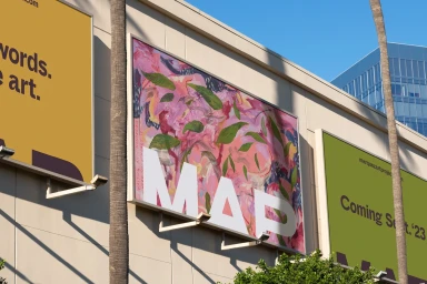
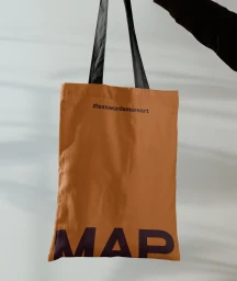
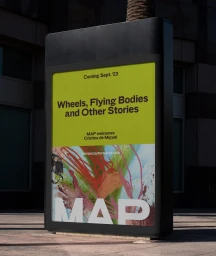
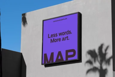
The brand identity for MAP, designed by Praline, establishes a visual language centered on modernist graphic principles and precise typography. The work spans a comprehensive range of touchpoints, from digital interface design and web layouts to stationery and environmental outdoor advertising. Each application adheres to a clean, minimalist aesthetic, prioritizing balanced spatial arrangement and bold, impactful type treatments. Across the campaign, the identity integrates vibrant, painterly illustrations and expressive abstract backgrounds, bridging contemporary digital design with a sophisticated artistic sensibility. Whether applied to large-scale billboards in urban environments or tactile print collateral like canvas tote bags and business cards, the system maintains visual cohesion through consistent typographic hierarchy and structural clarity.
Clean, Horizontal, Commercial
Typography
