WMC: Brand Identity

Mar 2021
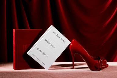
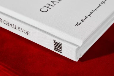
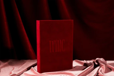
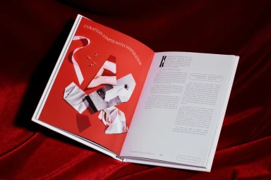
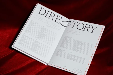
WMC establishes a cohesive brand identity through a series of editorial and commercial compositions. The project centres on The Wardrobe Makeover Challenge, utilizing a rich palette of deep crimson and muted pink to frame its printed collateral. Studio Sly leads the graphic design, balancing clean, structured typography with abstract collage illustrations by Xinxin Wen. Sam Wong’s photography emphasizes the tactile nature of the work, utilizing directional lighting to capture the texture of velvet backdrops, debossed book covers, and matte paper stock. Styling by Nat Turnbull and print production by Whites Law Bindery further elevate the series, highlighting the interplay between editorial layouts and physical book binding techniques.
Horizontal, Warm, Clean
Fabric Texture