
Brand
ProjectBrand Identity
Whereby Brand Identity 2019
Associated creatives

Tags
Description
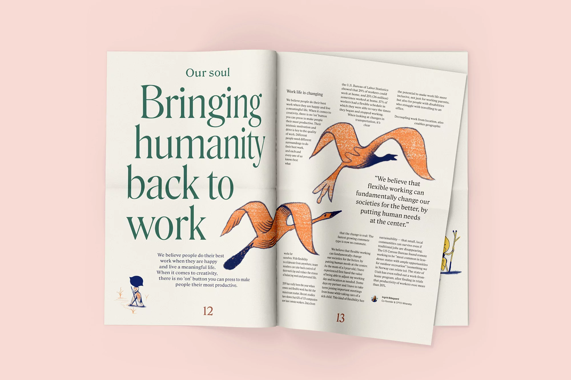
An open magazine spread showcases the brand identity for Whereby, created by Heydays. The left page features large green editorial typography with the heading bringing humanity back to work, alongside descriptive body text and a small character illustration. The right page displays two stylized orange bird illustrations soaring across columns of text, including a prominent quote about flexible working. The pages are presented against a solid pale pink background.