
VG: Brand Identity
Aug 2025
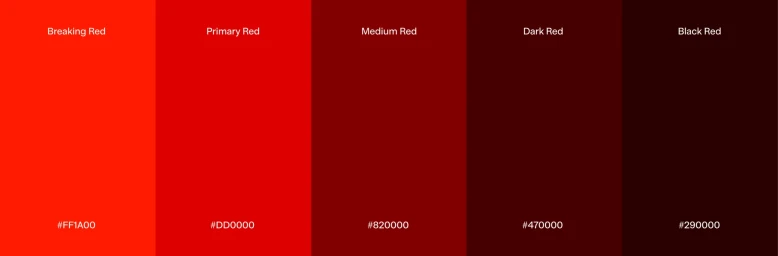
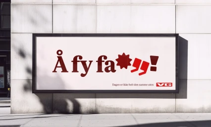
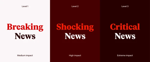
The brand identity refresh for VG establishes a cohesive visual language across digital publishing and physical media. Centered on a bold, high-contrast palette of deep red and white, the system prioritizes clarity and editorial impact through a robust typographic hierarchy. Developed by Bielke&Yang with illustration by Ole Magnus Saxegaard, the project utilizes variable font weights and vector graphic elements to translate across mobile interfaces, outdoor advertising, and branded merchandise. The design system leverages minimalist motion graphics and rhythmic typographic animation to organize news content, sports updates, and interactive media into a modular digital grid.
Horizontal, Commercial
Motion Graphics
Solid Colour
Brand Film / Corporate Video

