Underdays: Brand Identity

Aug 2023
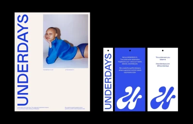
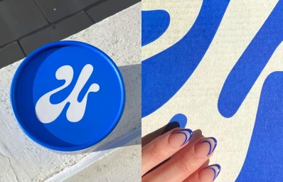
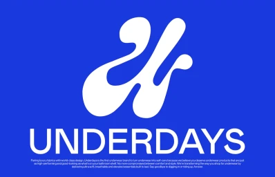
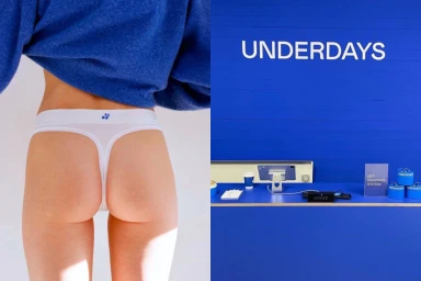
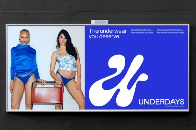
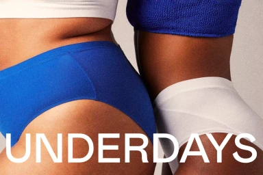
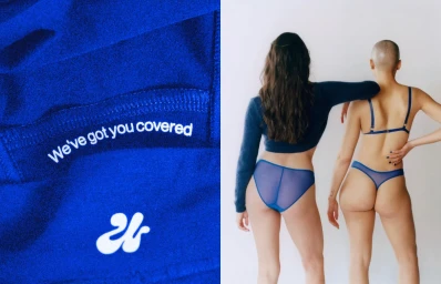
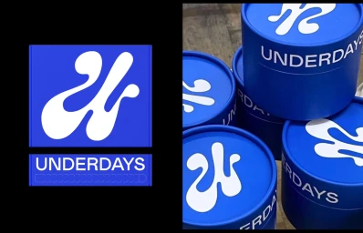
Underdays defines its brand identity through a high-contrast visual system centered on a saturated royal blue and white palette. The project spans apparel and packaging, utilizing a minimalist aesthetic to establish a cohesive presence across both physical product containers and commercial fashion imagery. Graphic design by Caramba Agency anchors the identity with fluid, organic monograms and bold, uppercase typography, often juxtaposed against clean studio backgrounds to highlight form and texture. The execution relies on precise graphic design and intentional composition, bridging studio portraiture with lifestyle outdoor photography. With photography by Charlie Gates, the work channels a polished, commercial feel, utilizing natural light and clean framing to emphasize the brand's graphic synergy. Across billboards, packaging, and digital assets, the project maintains a consistent visual rhythm through vector elements, high-contrast layouts, and a focus on essential product detail.
Horizontal, Commercial, Clean
Advertising Campaign