
UCR Arts: Brand Identity
Nov 2018
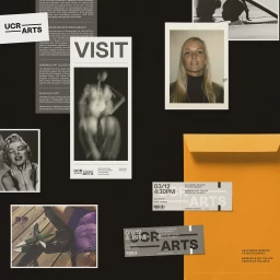
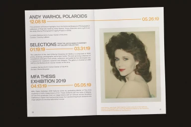
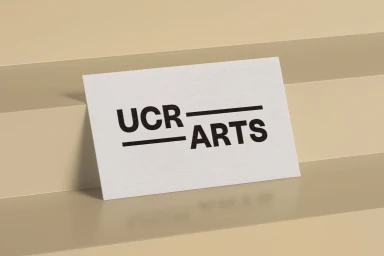
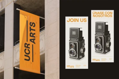
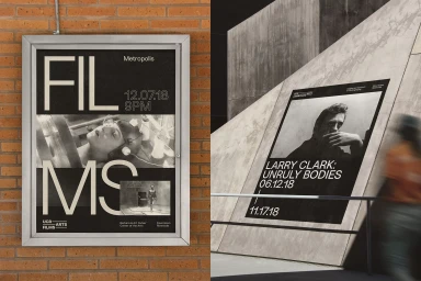
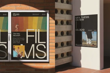
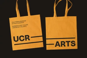
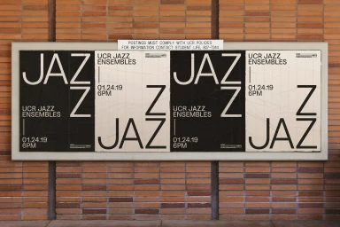
For UCR Arts, the graphic design studio Forth + Back has successfully translated the multifaceted essence of a major cultural institution into a cohesive brand identity that feels both archival and distinctly modern. By leveraging a bold, minimalist typographic system, the project establishes a rigorous visual language that scales seamlessly from small-format business cards to large-scale outdoor banners. The design utilizes high-contrast black and white elements to frame diverse institutional programming, from intimate film screenings to large-scale MFA thesis exhibitions. Throughout the collateral, the use of orange accents and structured horizontal bars provides a recurring visual anchor, effectively grounding the identity within a professional, contemporary framework. The execution leans into an editorial minimalism that allows the institution’s rotating content—including vintage Polaroid photography and monochromatic figure studies—to remain the focal point while maintaining a strict, grid-based aesthetic. Techniques such as clear, sans-serif typography and the strategic integration of commercial collage arrangements lend the brand a sophisticated, tactile quality. Whether applied to canvas tote bags or mounted against brutalist-inspired architectural surfaces, the identity feels deliberate and urgent, successfully bridging the gap between artistic exploration and institutional accessibility. Through this precise, highly structured approach, the identity functions as a versatile tool for clear visual communication within the complex landscape of digital media and entertainment.
Horizontal, Commercial, Minimalist
Typography
Advertising Campaign
