
VT Pro Design: Brand Identity
May 2019
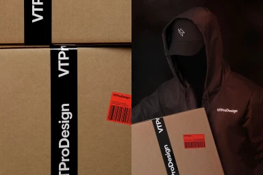
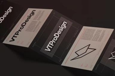
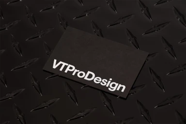
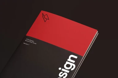
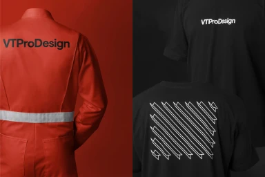
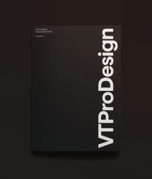
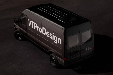
Forth + Back has meticulously sculpted the brand identity for VT Pro Design, delivering a visual system that feels as precise as the industrial work it represents. This corporate brand identity project leans into a disciplined, high-contrast aesthetic that marries utility with modern minimalism. The visual language is defined by a bold, monochromatic palette of deep charcoal and white, punctuated by sharp, tactical red accents. Throughout the project, the design team at Forth + Back leverages a clean sans-serif typography that communicates clarity and professional authority. The execution is remarkably cohesive, flowing seamlessly from technical brand guidelines and accordion-style brochures to tangible physical assets like matte business cards and industrial-grade apparel. The photography utilizes a low-key chiaroscuro approach, casting the brand’s shipping materials and cargo vehicle in a cinematic, moody light that emphasizes texture—from raw cardboard to diamond-plate metal. By blending commercial precision with a distinctly gritty, industrial edge, the work transcends standard corporate identity design. Each element, whether a simple logotype or a complex style guide, serves as a testament to structured, minimalist graphic design. The result is a robust, highly graphical system that feels both authoritative and approachable, effectively grounding the brand’s professional spirit in an environment that is as functional as it is visually arresting.
Horizontal, Commercial, Clean, Minimalist
