SPIRAL: Brand Identity
Feb 2021
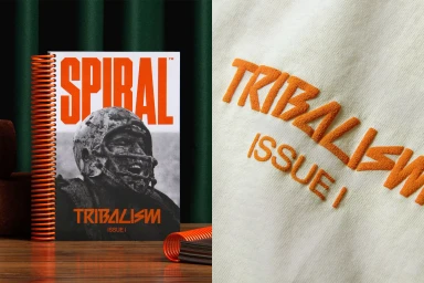
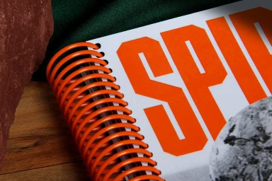
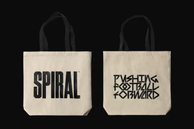
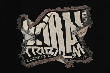
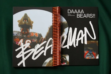
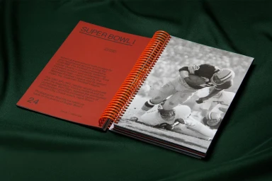
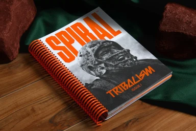
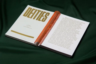
The SPIRAL brand identity project establishes a visual language centered on high-contrast typography and tactile editorial design. At its core is a 250-page publication featuring custom spiral binding and a diverse integration of illustration and graphic design by Forth + Back. The project employs a refined editorial aesthetic that balances bold, oversized type with structured layouts, utilizing diverse typeface contributions from Matt Willey, Lÿno, Radim Pesko, Grafier, Neue Montreal, and Pangram Pangram Foundry. Beyond print, the identity extends to soft goods including canvas tote bags and custom-woven textiles. These applications lean into tactile textures, emphasizing physical craft through embroidery and screen-printed elements. The documentation highlights a consistent visual hierarchy that bridges athletic photography with clean, graphic-led compositions, grounded by an earthy palette of deep greens and natural stone textures.
Editorial, Horizontal, Clean
Editorial