
Crown Royal: Brand Identity
Apr 2020
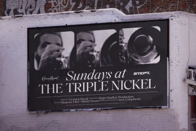
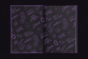
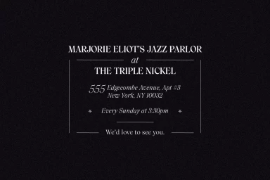
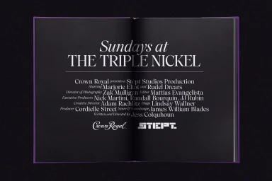
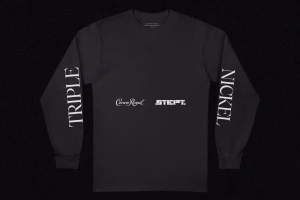
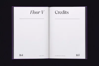
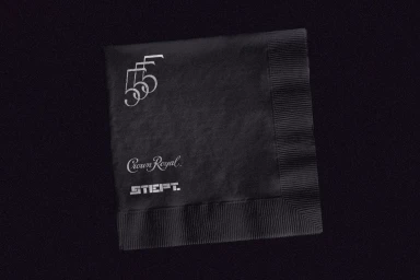
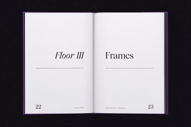
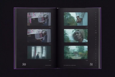
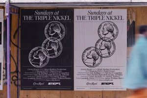
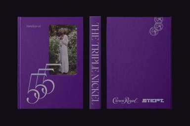
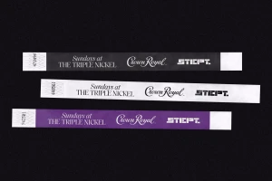
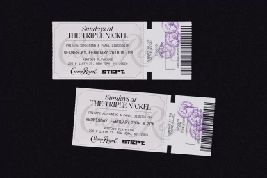
The brand identity for Crown Royal, titled Sundays at The Triple Nickel, serves as a masterclass in narrative-driven design within the alcoholic beverage industry. Executed with a sophisticated eye by Forth + Back, the project transcends traditional marketing by weaving a rich, cinematic story around the legacy of Marjorie Eliot's legendary jazz parlor. Through an exquisite fusion of editorial and commercial aesthetics, the identity employs a distinct visual language—anchored in deep, saturated purples and high-contrast, minimalist typography—that feels both historically reverent and distinctly modern. The execution spans a diverse range of touchpoints, from tactile, fabric-bound books featuring emboss and deboss detailing to utilitarian event ephemera like wristbands and tickets. Each element utilizes a restrained, typographic-heavy approach that allows the documentary-style imagery to anchor the brand in a real-world, atmospheric context. By leaning into live-action techniques and a rhythmic, film-strip composition, the work avoids the typical artifice of corporate branding, opting instead for an authentic, storytelling-focused methodology. The result is a cohesive, artistic suite that manages to elevate the Crown Royal brand by aligning it with the cultural heartbeat of New York’s jazz scene. It is a striking example of how corporate identity can successfully leverage editorial minimalism and professional layout design to foster genuine brand affinity while maintaining a clean, professional edge across every printed surface.
Horizontal, Commercial, Clean
Typography
