
Possible: Brand Identity

Nov 2020
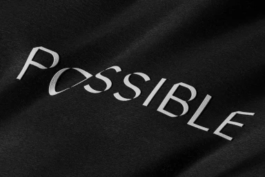
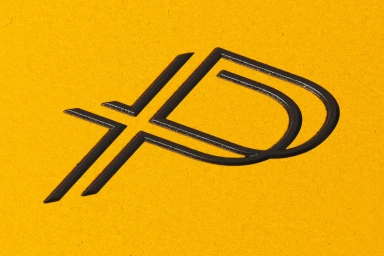
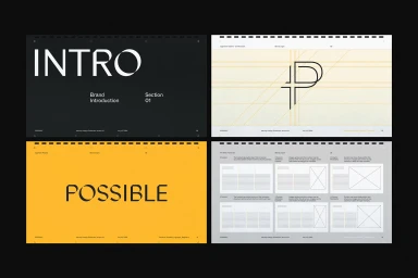
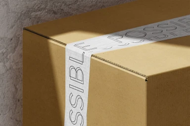
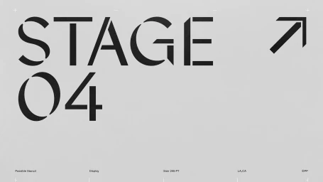
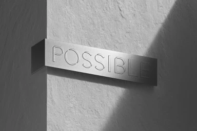
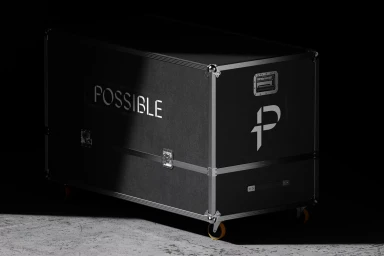
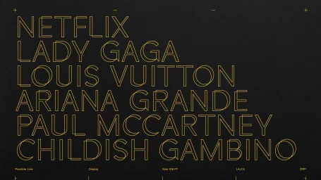
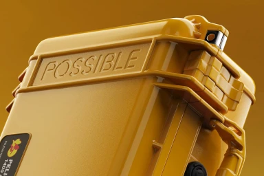
The brand identity for Possible establishes a versatile visual language rooted in structural precision and tactile material application. Developed by Forth + Back and Render Weekly, the project employs a rigorous grid system and minimalist typography to build a scalable system across both digital and physical touchpoints. The execution relies on 3D render / CGI techniques to explore varied textures, ranging from industrial concrete and corrugated cardboard to matte fabrics and high-gloss synthetics. This approach allows for a consistent application of the brand mark, whether debossed into textured paper or applied as graphic stencil elements on commercial equipment. Throughout the visual guidelines, the identity balances technical layout annotations with a clean, monochrome and yellow-accented color palette. The work prioritises clarity through geometric construction and sharp, directional lighting, framing the brand within an architectural and editorial context.
Horizontal, Commercial, Minimalist
3D render / CGI

