
Tower: Brand Identity


Dec 2023
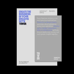
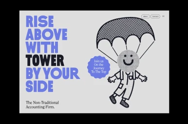
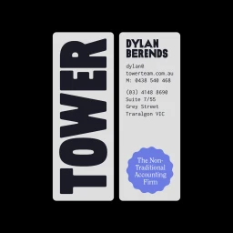
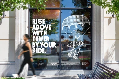
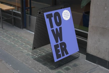
Tower’s brand identity project establishes a contemporary visual system anchored by clean typography and playful vector illustration. The identity leans into a minimalist aesthetic, pairing bold sans-serif typefaces with distinct halftone textures and a disciplined, high-contrast colour palette of blue, grey, and black. Developed by Studio Work, the graphic design creates a cohesive language across both physical and digital touchpoints, from stationery and business cards to storefront window installations and signage. The brand’s messaging is further extended through motion graphics by Stephen Grace, utilising kinetic typography and vector-style animation to communicate corporate identity. Illustration work by Totally Okay integrates character-driven elements, providing a whimsical counterpoint to the structured layout. The overall execution highlights a non-traditional approach for the accounting sector, prioritising clarity and modern design principles.
Horizontal, Clean, Commercial


