
BrandThe Soap Co.
ProjectBrand Identity
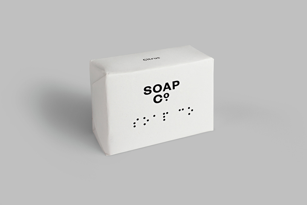
The Soap Co. Brand Identity 2015
Associated creatives

Tags
Description
A clean product photograph showcases a bar of soap wrapped in matte white paper against a neutral grey seamless background. The packaging features bold black typography with the brand name and scent descriptor alongside embossed braille dots. Soft, directional lighting creates gentle shadows beneath the rectangular package, highlighting the crisp paper texture. Designed by Paul Belford Ltd for The Soap Co. brand identity project.
Style
Horizontal, Commercial, Clean, Minimalist
Techniques
Emboss & Deboss
Industries
CPG / Packaged Food
Color
Pure White (70%)
Jet Black (30%)
Background
Grey Seamless
Context
E-commerce / Product