
BrandThe Soap Co.
ProjectBrand Identity
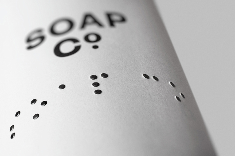
The Soap Co. Brand Identity 2015
Associated creatives

Tags
Description
This clean product detail shot showcases the brand identity for The Soap Co. created by Paul Belford Ltd. The image features a close-up angle of white textured paper packaging printed with bold black typography reading SOAP CO. Below the brand name, tactile braille dots are subtly debossed into the surface, creating a sophisticated and accessible design detail. Soft directional lighting highlights the subtle shadows in the debossed paper texture, emphasizing the minimalist aesthetic.
Style
Vertical, Commercial, Clean, Minimalist
Techniques
Natural light, Emboss & Deboss
Color
Pure White (80%)
Jet Black (20%)
Background
White Seamless
Context
E-commerce / Product