
Brand
ProjectBrand Identity
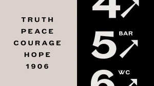
The OWO Brand Identity 2021
Associated creatives

Tags
Description
This graphic design piece presents a brand identity application featuring bold, clean typography and directional wayfinding elements. The composition is split vertically into a cream panel on the left with stacked black text reading truth, peace, courage, hope, and the year 1906, and a black panel on the right displaying large white numbers and directional arrows alongside labels like bar and wc. The clean, graphic layout employs high-contrast monochrome tones and precise alignment. Created by Greenspace for The OWO brand identity project.