
Brand
ProjectBrand Identity
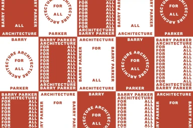
The District Brand Identity 2019
Associated creatives

Tags
Description
This graphic design piece showcases a bold brand identity pattern created by The District for Barry Parker Architecture. The composition consists of a repeating grid featuring alternating terracotta red and white panels filled with distinctive architectural typography. Circular and rectangular frames constructed from repeating text read Barry Parker Architecture for All. The clean layout demonstrates a strong graphic approach with balanced contrast and rhythmic repetition.