
Taipan
Rebrand
Dec 2025
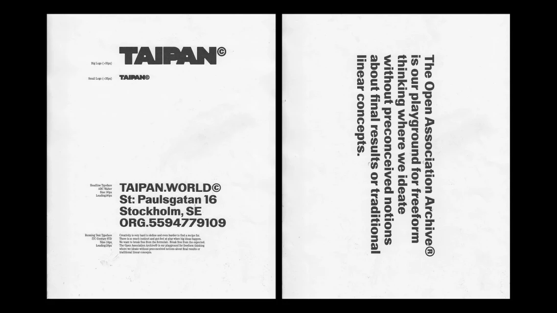
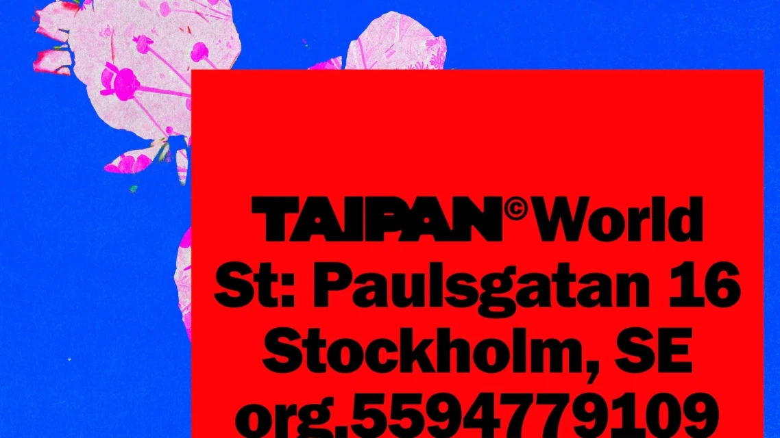
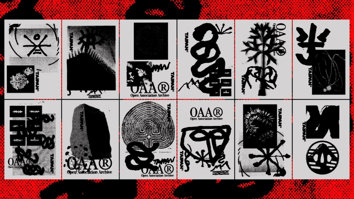
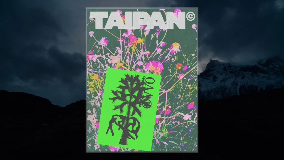
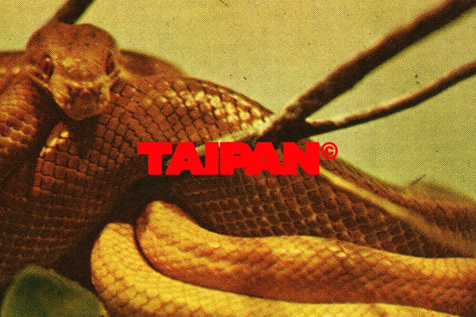
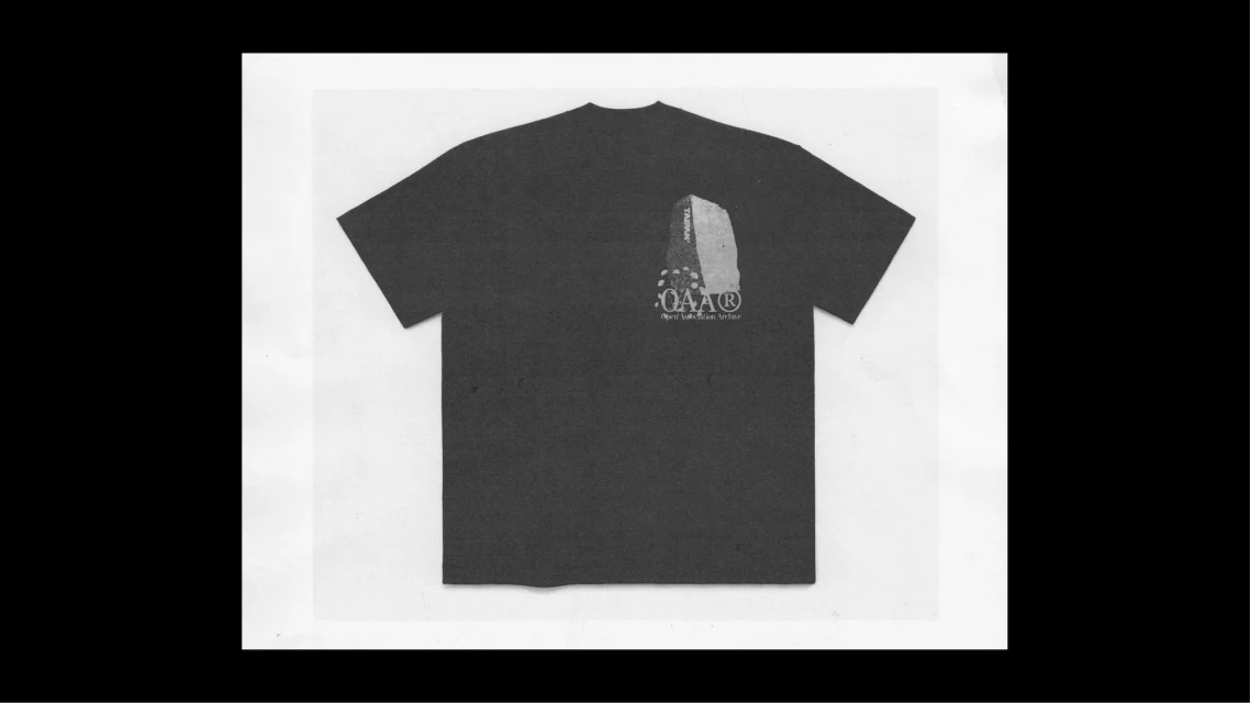
The Taipan rebrand, executed by Studio Albin Holmqvist, establishes a versatile visual identity system through an experimental fusion of graphic design and motion graphics. The project integrates high-contrast typography with diverse aesthetic treatments, ranging from clean, minimalist digital layouts to gritty, textured print-style compositions. By blending bold sans-serif lettering with floral illustrations, natural imagery, and 3D metallic elements, the identity leans into a modular framework that adapts across both cinematic video content and stationary brand assets. The collateral spans a wide spectrum of applications, including apparel, editorial guidelines, and dynamic digital sequences. The application of motion graphics and live-action techniques provides a consistent, rhythmic pace, while the use of saturated colors and monochrome, grainy palettes highlights the flexibility of the brand’s typographic and iconic systems.
Horizontal, Commercial
Typography
