
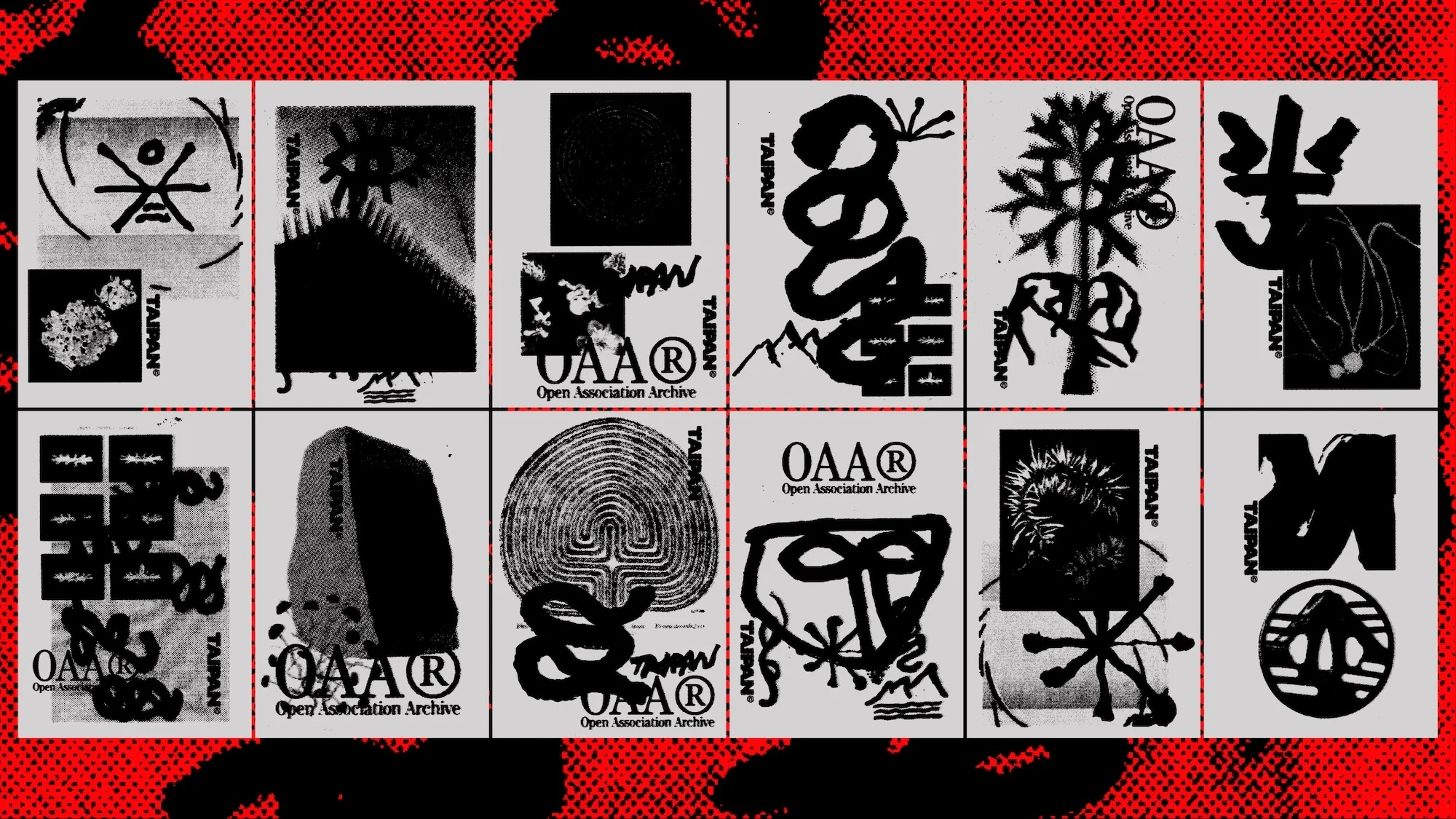
Taipan Rebrand 2025
Associated creatives

Tags
Description
A grid of twelve black and white graphic design posters displayed against a textured red background with darker abstract marks. Each panel within the grid presents a distinct experimental composition, incorporating minimalist symbols, expressive brushwork, botanical illustrations, and textured patterns. The repeated inclusion of the Taipan brand name and the Open Association Archive acronym links the diverse individual panels into a cohesive visual identity system. The overall aesthetic combines lo-fi print characteristics with contemporary graphic layouts.
Style
Horizontal, Commercial, Monochrome, Gritty, Grainy, Graphic
Techniques
Screen print / silkscreen
Color
Jet Black (50%)
Pure White (50%)
Background
Gradient
Context
Advertising Campaign