
Shorty's
Brand Identity

Mar 2018
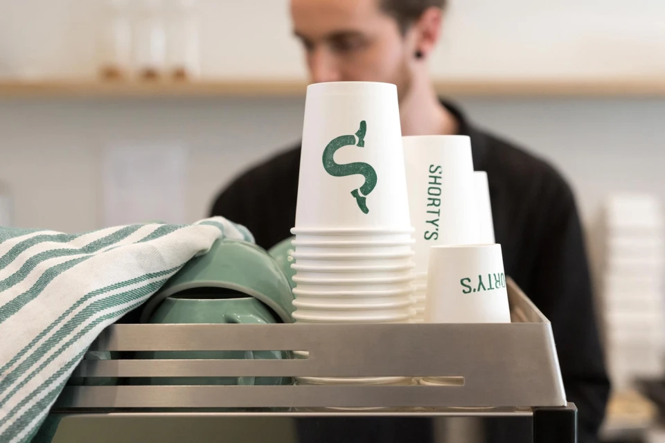
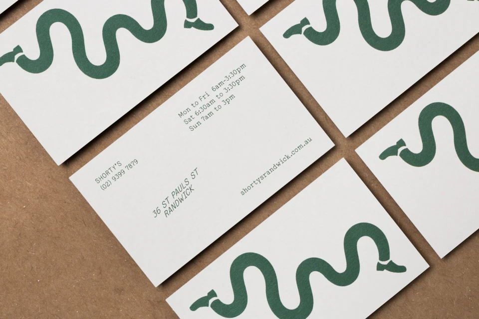
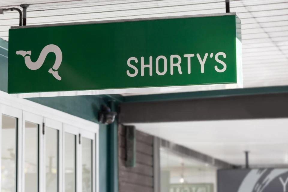
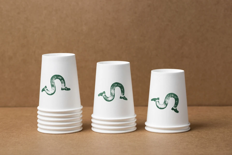
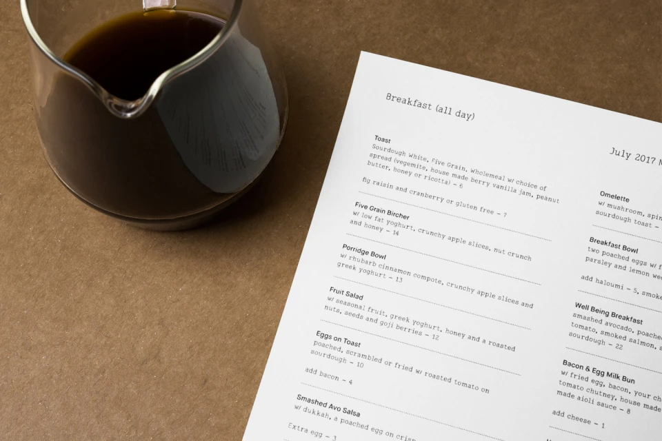
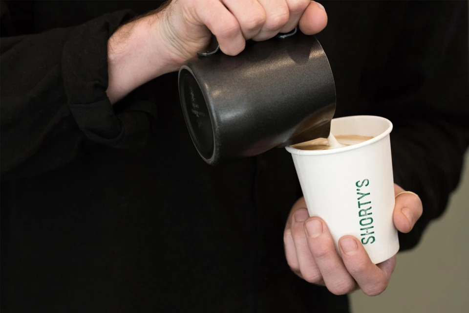
Shorty's new brand identity project in the restaurant, food and beverage sector masterfully balances whimsy with a disciplined commercial aesthetic. By leaning into a distinctive, sinuous line motif that playfully transforms into stylized legs and shoes, the visual system injects a memorable personality into everyday touchpoints. The project, brought to life through the creative expertise of The Colour Club, successfully translates this playful graphic language across a comprehensive range of assets, from sleek storefront signage to the tactile precision of menu design and business cards. Each element adheres to a clean, minimalist approach, utilizing a sophisticated deep forest green and neutral palette that elevates the brand above standard cafe visuals. Whether capturing the rhythmic pattern of vector illustrations or the cozy, authentic atmosphere of a professional service area, the imagery consistently utilizes natural light to highlight textures like matte paper and industrial espresso equipment. This commercial branding exercise demonstrates how high-end typography and thoughtful graphic simplicity can unify disparate physical items into a cohesive, modern ecosystem. The result is a refined, cohesive identity that feels both professional and approachable, turning everyday coffee service into a curated lifestyle experience that resonates with a discerning modern audience looking for character in their local hangouts.
Horizontal, Commercial, Clean, Minimalist
Advertising Campaign
