
Sesión Tequila: Brand Identity
Apr 2020
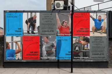
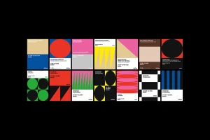
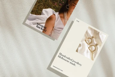
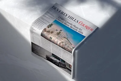
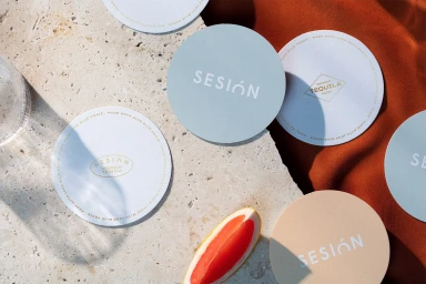
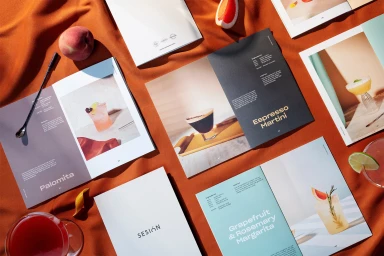
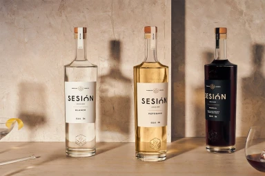
The brand identity for Sesión Tequila represents a masterclass in premium beverage positioning, where editorial precision meets the tactile warmth of high-end lifestyle design. Through a deliberate orchestration of Commercial photography and sophisticated Typography, the project establishes a cohesive visual language that feels both grounded and aspirational. Across a diverse range of collateral—from recipe booklets and circular coasters to expansive outdoor billboards—the visual system leans into a balance of natural elements and sharp, modern geometry. The use of directional light and soft light techniques breathes life into the product, casting elongated shadows that emphasize the texture of stone surfaces and the crisp lines of minimalist sans-serif and serif type. By pairing vibrant citrus accents with a neutral, earthen palette, the brand effectively mirrors the luxury of the spirits themselves. The execution, supported by creative contributions from Re, Hype Type, Studio Reko, and Diferente, avoids unnecessary clutter to prioritize an elegant, balanced aesthetic. Whether highlighting the intricate details of a handcrafted cocktail or the systematic composition of a graphic poster, every asset serves to elevate the Sesión brand as a fixture of modern hospitality. Ultimately, the work succeeds by translating the essence of a premium drinking experience into a versatile toolkit that remains consistent, elevated, and deeply evocative.
Horizontal, Commercial, Clean
Advertising Campaign


