
Keepy: Brand Identity




Oct 2019
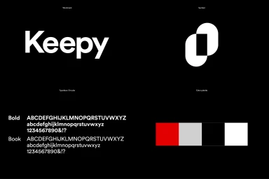
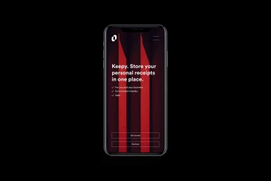
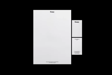
In the fast-paced realm of apps and digital platforms, Keepy emerges with a sophisticated brand identity that prioritizes clarity, structural precision, and high-impact visual communication. Developed by Studio Reko, this corporate branding initiative masterfully leverages a stark, high-contrast aesthetic of vibrant red, matte black, and crisp white to anchor the identity of the financial technology tool. The design system is fundamentally reductionist, leaning into geometric minimalism to create a cohesive visual language that spans from mobile UI illustrations to traditional stationery suites. By utilizing a clean, modern sans-serif typography, the project ensures maximum legibility across all touchpoints, whether the user is engaging with a smartphone interface for tax management or viewing a formal letterhead. The technical rigor of the work is particularly evident in the construction studies provided, which reveal a deep commitment to mathematical precision through circular forms and grid-based development. This focus on vector design and deliberate composition channels a sense of professional authority and digital efficiency. Ultimately, the Keepy brand identity stands as a testament to the power of stripping away the superfluous to highlight product utility, proving that even the most complex digital financial services can be articulated through an elegant, minimalist framework that feels both accessible and distinctly modern in a crowded technological marketplace.
Horizontal, Commercial, Minimalist
Typography, Vector
Black Seamless
