
Schulhaus Tirol: Brand Identity

May 2022
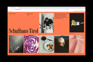
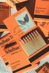
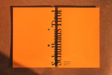
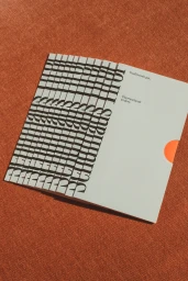
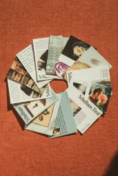
Studio Furore crafts a cohesive brand identity for Schulhaus Tirol, anchoring the project in a palette of vibrant orange and grounded, earthy textures. The visual system leverages a graphic, editorial sensibility to bridge digital interfaces with physical collateral, utilizing screen print / silkscreen techniques across a suite of promotional brochures, packaging, and cards. The identity features a clean, systematic use of bold serif typography paired with macro photography. Kurt Bauer captures these tactile elements, focusing on high-contrast compositions of produce, textiles, and wine-related imagery. Studio Brighten supported the execution through web development, ensuring the brand's aesthetic translates seamlessly into a dynamic, grid-based online interface.
Commercial, Clean, Vertical
Fabric Texture
Advertising Campaign


