
Brand
ProjectBrand Identity
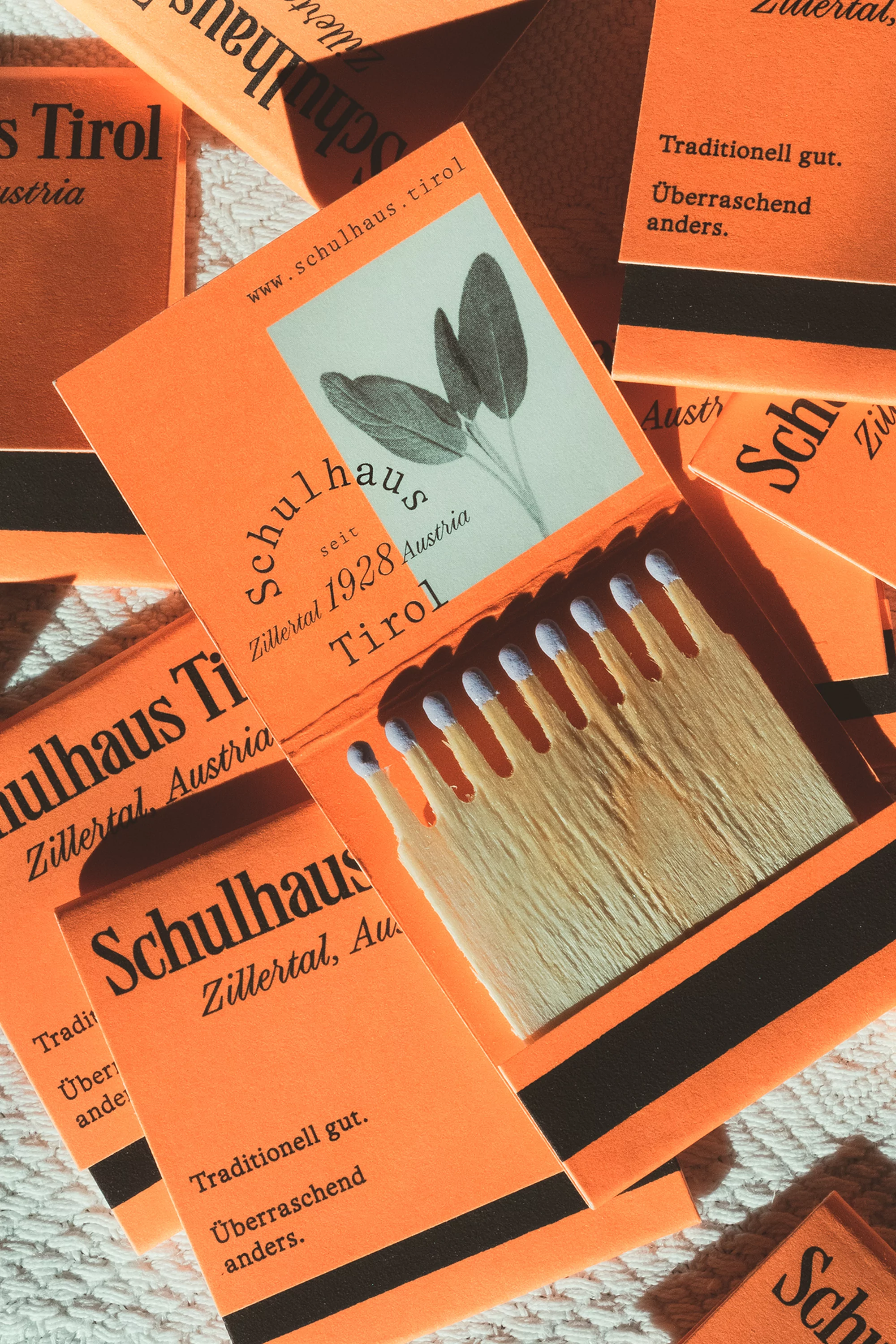
Schulhaus Tirol Brand Identity 2022
Associated creatives


Tags
Description
This image showcases the custom brand identity and packaging design for Schulhaus Tirol, created by Studio Furore with photography by Kurt Bauer. The composition features a flat lay of vibrant orange matchbook covers arranged on a textured surface. Each matchbook prominently displays black typography reading Schulhaus Tirol Zillertal Austria, accompanied by a botanical leaf illustration and a bold black stripe. Inside the open matchbook, wooden matches with light purple tips are neatly lined up. Additional branded packaging pieces are fanned out in the background, highlighting the cohesive graphic design system.