
Saul Studio: Brand Identity

Jul 2019
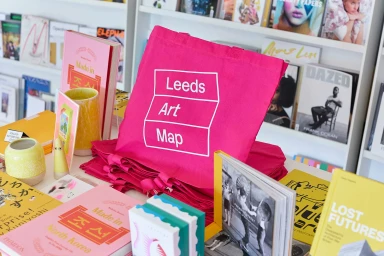
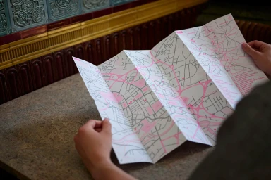
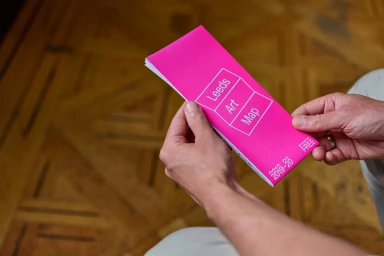
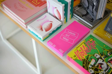
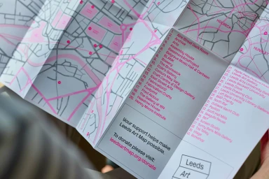
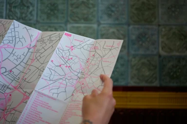
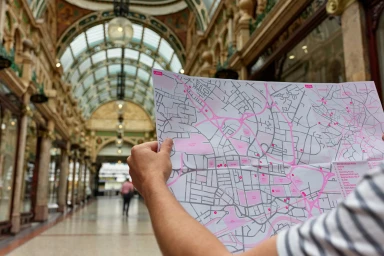
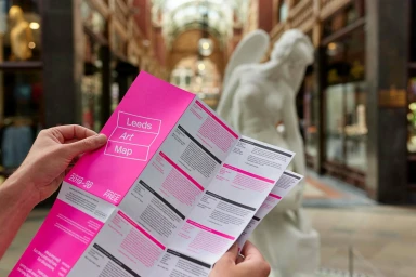
For the Leeds Art Map, Saul Studio has crafted a vibrant brand identity that perfectly captures the intersection of contemporary design and urban exploration. This project seamlessly integrates editorial sensibilities with functional information design, resulting in a cohesive suite of collateral that feels both tactile and modern. Across the various print materials—ranging from folded accordion brochures to promotional tote bags—the visual language leans heavily into a bold, high-contrast palette of neon pink, yellow, and green. This striking use of color serves to anchor the map as a standout cultural guide, while minimalist white typography ensures that the dense informational content remains accessible and clean. Through the lens of photographer Justin Slee, the identity is brought to life in a series of lifestyle images that emphasize the interplay between paper, stone, and architectural depth. The work channels a sophisticated aesthetic, utilizing natural light and macro-focused compositions to highlight the material quality of the printed brochures. By balancing stark, graphic layouts with the organic textures of public gallery spaces and Victorian-era shopping arcades, the project reads as an essential, high-utility toolkit for navigators of the Leeds arts scene. It is a masterful exercise in environmental branding that elevates essential infographics into a collectible, design-forward experience, showcasing how effective typography and thoughtful composition can redefine the way audiences interact with urban navigation.
Horizontal, Clean, Editorial
Natural light
Advertising Campaign

