
Leeds RAG Fashion Show
Brand Identity
Mar 2018
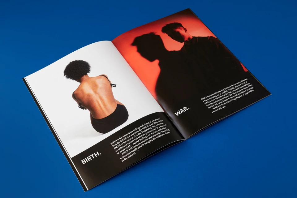
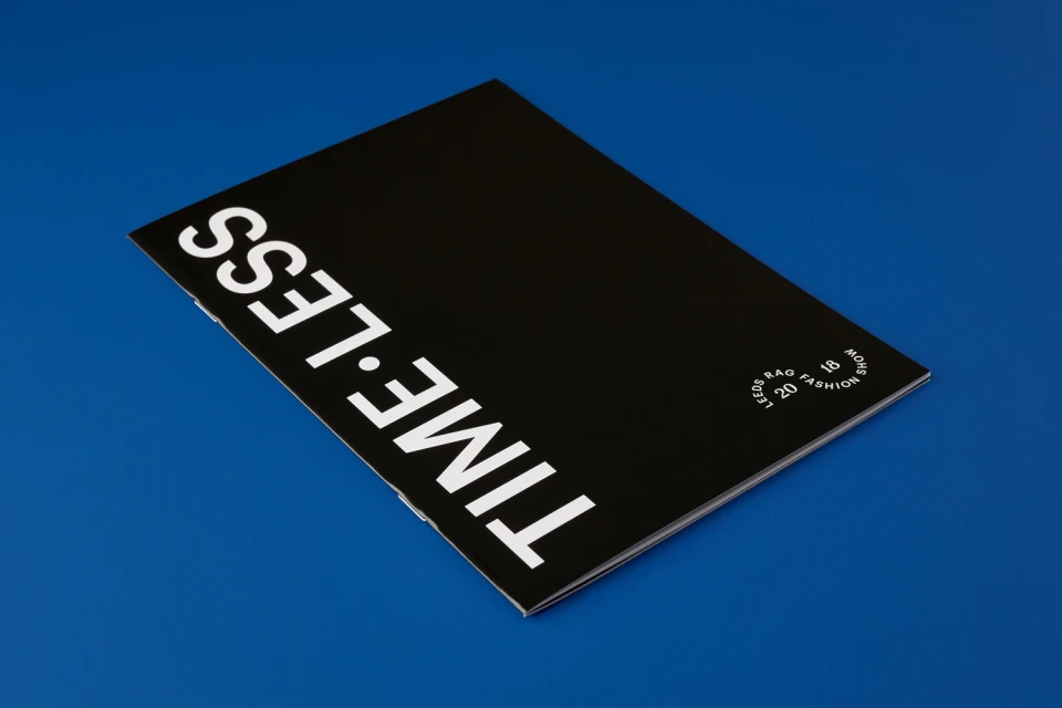
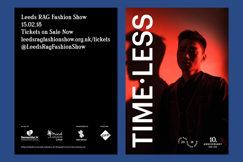
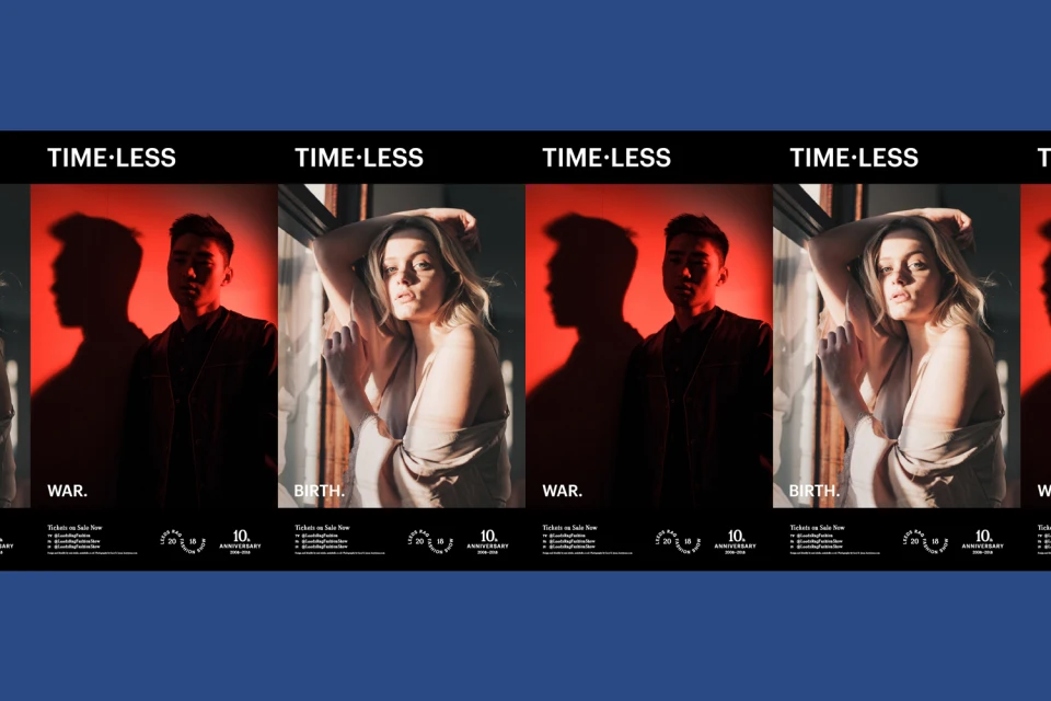
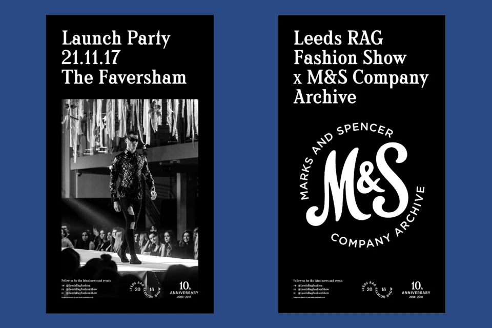
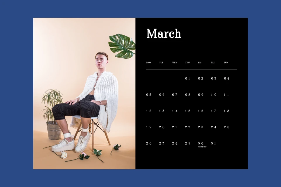
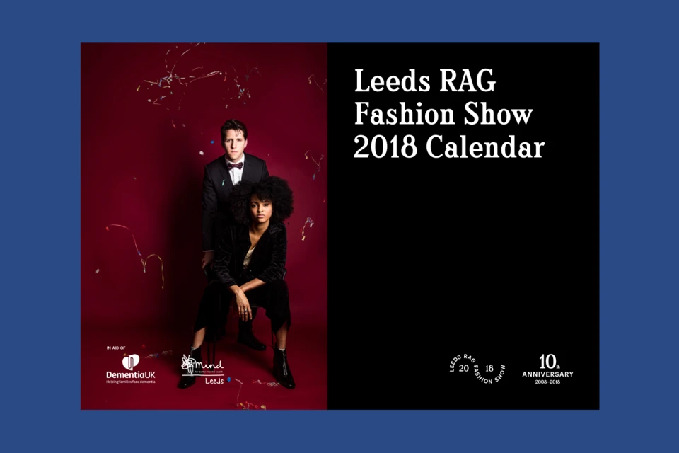
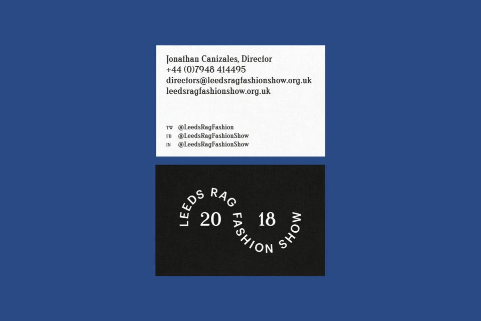
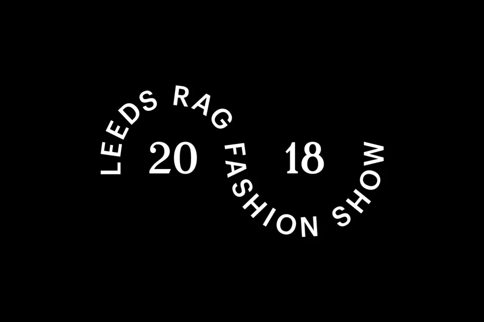
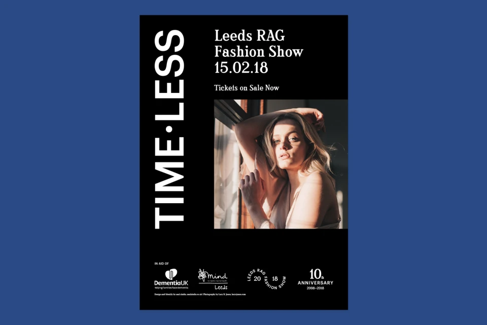
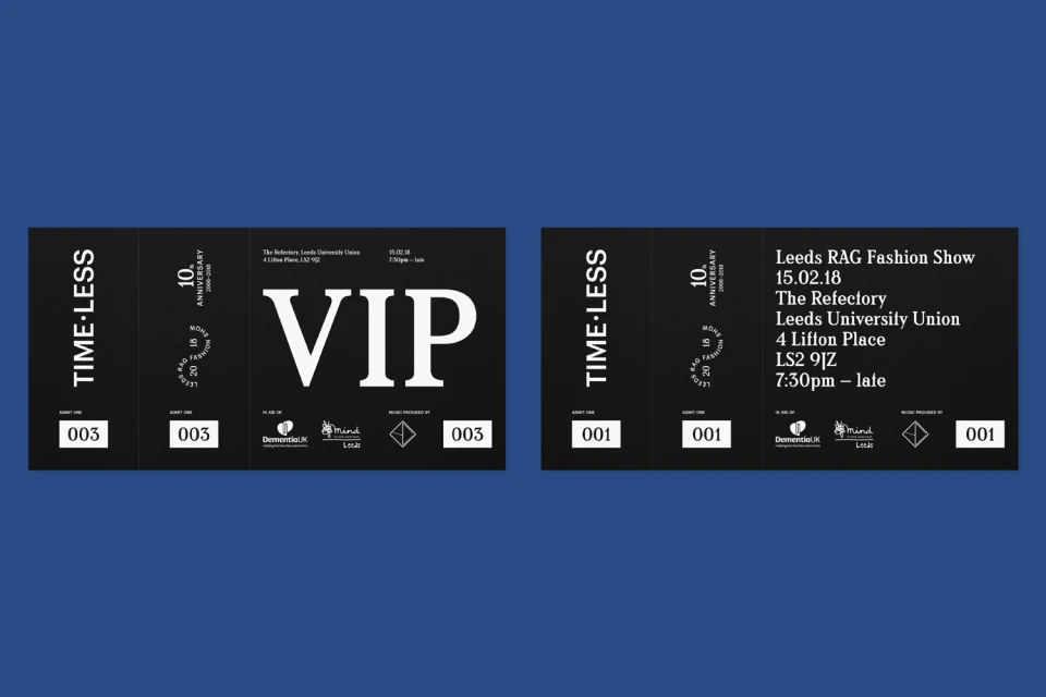
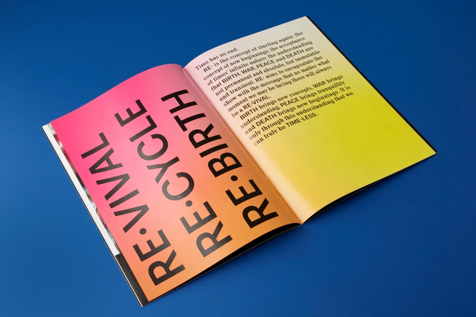
The brand identity for the Leeds RAG Fashion Show functions as a masterclass in structural storytelling, bridging the gap between high-fashion editorial aesthetics and the functional demands of a large-scale event within the Festivals and Events and Media and Entertainment industries. Conceptualized with a sophisticated focus on the theme of duality, the project leans into a minimalist yet high-contrast design language that effectively balances stark, graphic layouts with cinematic portraiture. Through the use of bold, sans-serif typography and a rigorous interplay of natural light and studio strobe lighting, the identity establishes a sense of timeless elegance. Saul Studio demonstrates a keen eye for visual rhythm, utilizing low-key chiaroscuro techniques to imbue promotional collateral, VIP tickets, and event posters with a sense of gravity and prestige. The project manages to integrate complex informational hierarchies—ranging from launch party details to collaborative charity branding—into a cohesive, sleek package that feels both modern and permanent. By juxtaposing vibrant color blocking against deep, moody shadows, the design successfully elevates the fashion show beyond a mere event, framing it instead as a structured, artistic movement. This cohesive brand identity serves as the backbone for the organization’s 10th-anniversary celebration, ensuring every touchpoint remains grounded in an aesthetic that is as professionally disciplined as it is visually striking and intellectually compelling.
Horizontal, Clean, Commercial, Graphic
Typography
Solid Colour
Advertising Campaign
