
Piña: Brand Identity
Aug 2018
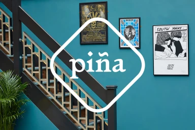
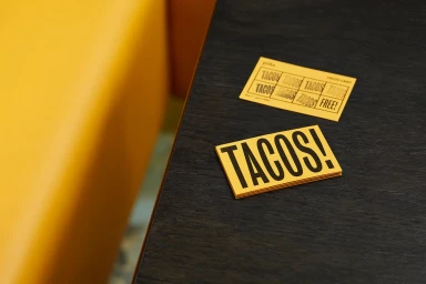
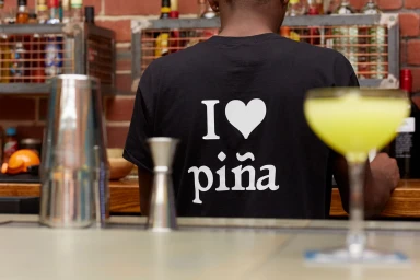
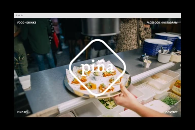
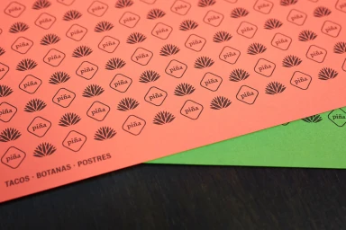
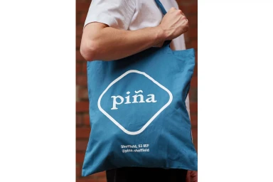
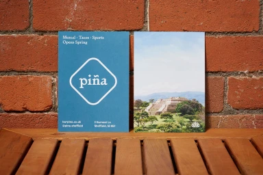
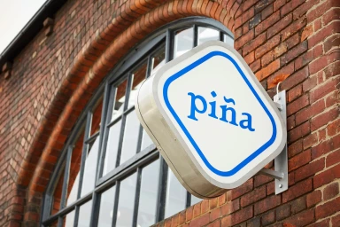
The brand identity for Piña, masterfully executed by Saul Studio, breathes fresh energy into the hospitality sector through a vibrant, geometric-led visual language that perfectly balances playfulness and professional polish. This project demonstrates how a cohesive design system can elevate a food and beverage brand, utilizing a bold color palette of teal, coral, and lime green to create a distinctive, contemporary aesthetic. The identity channels a modern, urban spirit, layering minimalist typography against the raw, industrial backdrop of textured brick and warm wood finishes. Whether showcased through UI illustration in digital web interfaces or applied to tangible collateral like loyalty cards and canvas totes, the branding remains anchored by its recurring rounded-diamond motif. By blending lifestyle photography with clean graphic design, the project creates an immersive narrative that extends from the physical restaurant environment to the customer's personal experience. Utilizing natural light to accentuate the textures of signage and printed stationery, the team has crafted a look that is both highly functional and visually arresting. Every element, from the playful menu cards to the subtle agave-patterned paper stocks, speaks to a sophisticated approach to restaurant branding. Ultimately, this work stands as a testament to the power of consistent, thoughtful design in establishing a memorable consumer-facing presence in the competitive culinary space.
Horizontal, Commercial, Clean
Advertising Campaign
