
We Make Cake
Brand Identity
Dec 2017
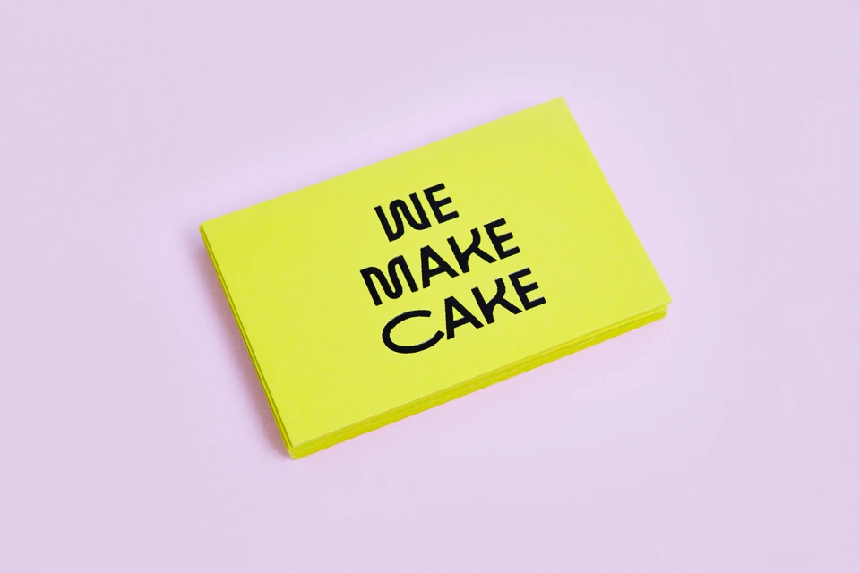
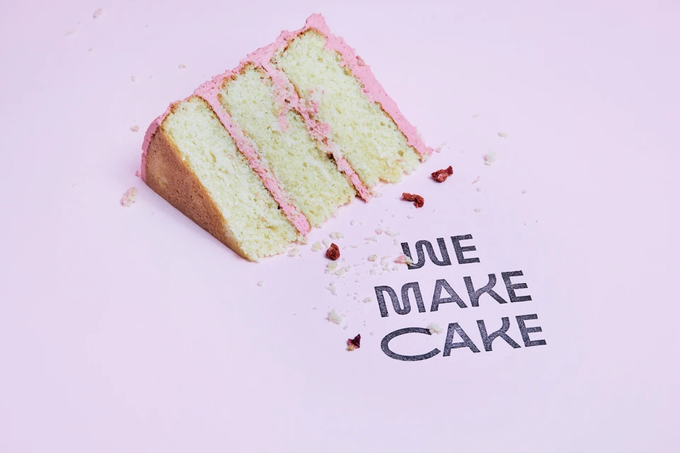
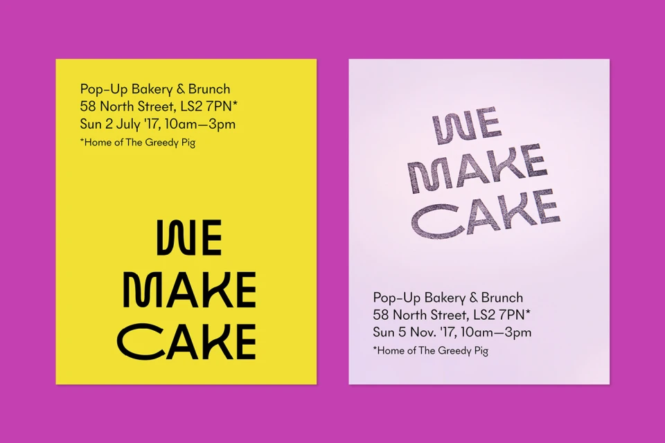
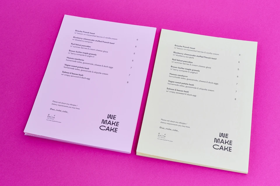
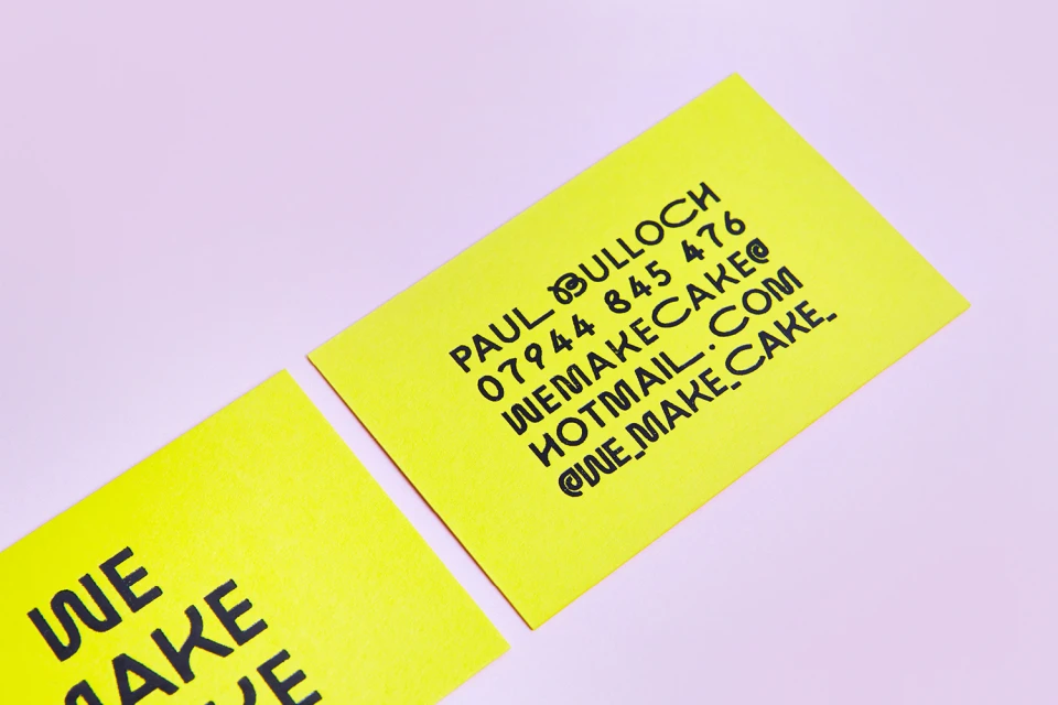
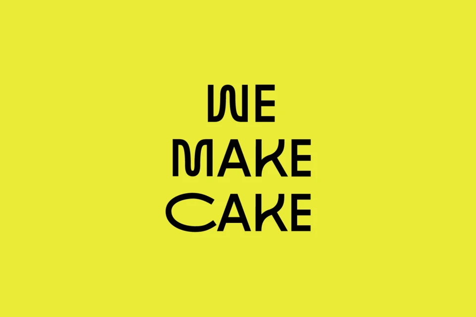
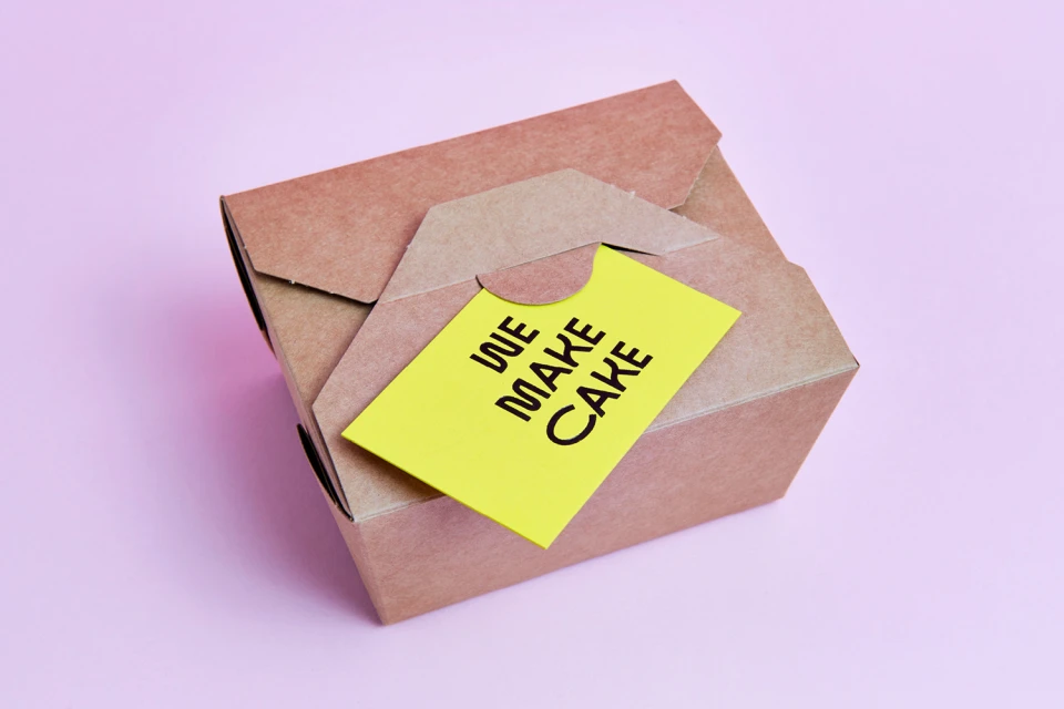
The new brand identity for We Make Cake establishes a high-contrast visual language that bridges the gap between culinary craft and graphic minimalism. Executed with a sharp focus on modern typography and color theory, the project leans into a palette of saturated magenta, neon yellow, and soft pastels to define a distinct market presence. By pairing these punchy hues with clean, sans-serif letterforms, the design system ensures that every touchpoint—from business cards to promotional flyers and takeaway packaging—feels cohesive and undeniably contemporary. The work of Saul Studio is central to this aesthetic, utilizing deliberate composition and flat, even lighting to highlight the structural beauty of the printed materials. Whether through the playful, rounded lettering featured in the core logo or the tactical use of diverse paper stocks, the branding emphasizes a clean and graphic quality that feels both approachable and professional. The execution shifts seamlessly between studio strobe techniques for precise product shots and natural light for more lifestyle-oriented bakery imagery, maintaining a consistent editorial minimalism throughout. This comprehensive approach proves that effective corporate identity does not require clutter; instead, it relies on the careful balance of playful type, deliberate negative space, and bold color blocking to leave a lasting, vibrant impression on the consumer at every interaction.
Commercial, Clean, Minimalist, Horizontal
CPG / Packaged Food
