
Barnaby Horn: Brand Identity



May 2018
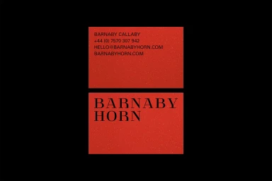
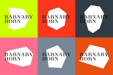
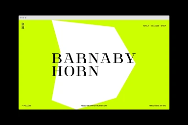
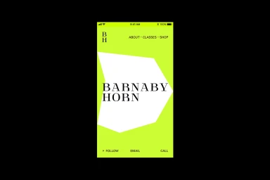
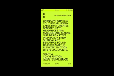
The brand identity for Barnaby Horn, developed by Saul Studio, masterfully synthesizes the worlds of couture millinery and contemporary graphic design. By leveraging a high-contrast aesthetic that leans into vibrant, saturated backgrounds—ranging from neon yellow to lime green—the project establishes a visual language that is as audacious as the brand’s bespoke headpieces. The work functions as a study in editorial minimalism, utilizing clean, serif typography and sharp, irregular white polygonal shapes that provide a sense of balanced asymmetry. This identity system effectively bridges the gap between commercial corporate presence and artistic expression, as seen in the playful yet structured UI illustration of the mobile and web interfaces. The design avoids unnecessary clutter, favoring a strategy rooted in bold color blocking and negative space to allow the intricate, sculptural nature of the physical products, such as the crystal-encrusted and horn-accented masks, to take center stage. Through the consistent application of vector-based brand marks and a disciplined grid system, the identity maintains a cohesive, modern luxury sensibility across digital and physical touchpoints. This brand identity project serves as a clear, impactful showcase of how a minimalist approach to typography and geometry can elevate a niche, creative brand into a sophisticated and instantly recognizable market presence, ensuring that every interaction—from a business card to a digital screen—remains intentional, functional, and striking.
Horizontal, Commercial, Graphic
Vector
Solid Colour
Website / Web
