
San Francisco Symphony: Brand Identity




Feb 2021
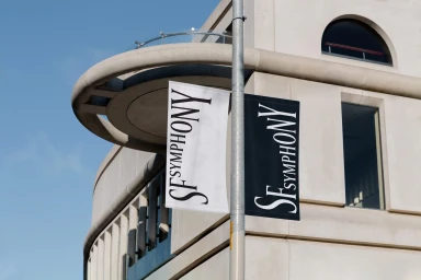
COLLINS developed a comprehensive brand identity for the San Francisco Symphony, establishing a visual language that balances classical heritage with contemporary graphic storytelling. The project centers on bold, experimental typography as the primary narrative element, utilizing a modular system that scales across physical and digital environments. Execution ranges from high-contrast monochrome print collateral and outdoor installations to kinetic motion graphics. The design system incorporates a flexible typographic framework, evidenced by UI elements that allow for modulation of weight and baseline, alongside vibrant color palettes that modernize the symphony's presence. By integrating clean geometric forms and tactile paper materials, the identity functions as a cohesive visual system across concert materials, environmental signage, and social media assets.
Horizontal, Commercial, Clean
Typography
