Robinhood: Brand Identity



Aug 2020
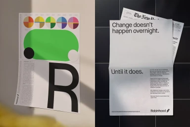
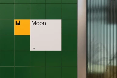
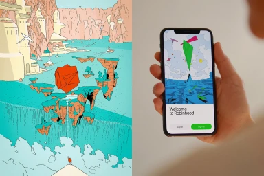
Robinhood’s evolution into a household name within the competitive fintech landscape is defined by a masterclass in brand identity design that expertly balances corporate authority with an approachable, human-centric aesthetic. Orchestrated by the creative agency COLLINS, this visual system leans into a highly graphic and minimalist design language that prioritizes clarity through bold typography and a distinct, high-contrast color palette of lime green, black, and orange. The project expertly integrates diverse artistic contributions, featuring the evocative illustration work of Ilya Milstein, Jaedoo Lee, and Liam Cobb to humanize complex financial concepts. By juxtaposing architectural signage and structural photography by David William Baum against fluid UI illustration and dynamic vector assets, the brand identity creates a seamless bridge between tangible physical spaces and the digital interface. Whether through a newspaper-style print advertisement or a sleek smartphone welcome screen, the system channels a sense of accessibility that demystifies investing. The application of UI illustration and intentional corporate iconography ensures that the platform feels both professional and innovative. This cohesive approach to visual storytelling proves that financial services can successfully adopt a contemporary, artistic sensibility without losing the functional precision required for a platform focused on digital growth and user empowerment, ultimately setting a new standard for modern financial design.
Horizontal, Minimalist, Commercial
Advertising Campaign