
Refactor Capital: Brand Identity


Mar 2022
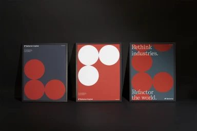
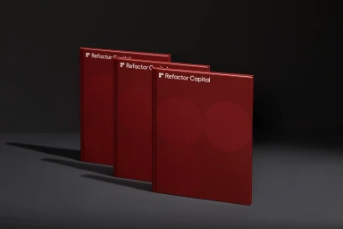
This brand identity project for Refactor Capital establishes a visual language rooted in minimalist design and geometric precision. Developed with graphic design by Play, the system spans both physical and digital collateral, utilizing a consistent palette of deep red, white, and cream. Across a suite of business stationery, posters, and hardcover books, the work leans into clean typography and structured compositions to communicate the firm’s identity. The aesthetic extends into motion graphics, where restrained motion and serif lettering transition through thematic sequences. Digital touchpoints, including a web interface designed by Visie Admin, mirror the print assets' matte, high-contrast sensibility. By leveraging sharp, directional lighting and clean graphic layouts, the project maintains a sophisticated corporate look across every channel.
Horizontal, Clean, Commercial
Typography
Brand Film / Corporate Video
