
Landmark: Brand Identity


Jul 2020
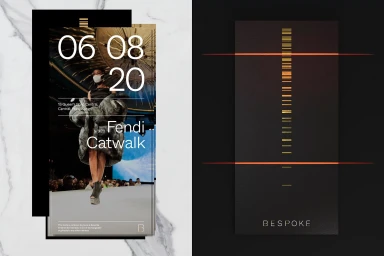
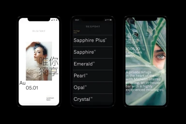
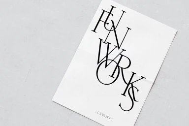
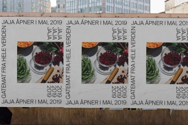
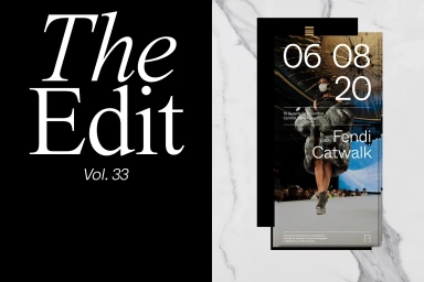
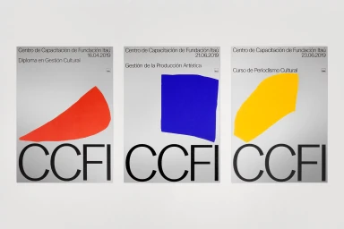
The Brand Identity project for Landmark serves as an expansive exploration into luxury visual language and corporate design, seamlessly bridging the gap between high-fashion editorial aesthetics and minimalist institutional communication. Orchestrated by a collaborative creative collective including Alphabetical, Play, Reklamekollektivet, ZAINA, and North, the project establishes a rigorous visual system that balances structural complexity with refined simplicity. The work leverages bold typography and a deliberate use of negative space to create a sense of high-end exclusivity across varied mediums, ranging from bespoke membership interfaces for the Bespoke program to sophisticated welcome kits encased in industrial packaging. Throughout the identity, the designers lean into a sophisticated editorial style, utilizing high-key photography and organic textures to ground the brand in both materiality and modern digital precision. Whether through the clean, symmetrical geometry of embossed FOPE logos or the rhythmic, high-contrast layouts seen in print stationery, the project demonstrates a masterful command of visual hierarchy. By synthesizing disparate elements—like macro foliage photography and sharp, geometric vector forms—into a cohesive brand identity, the team ensures that Landmark remains a paragon of corporate sophistication, utilizing tactile finishes and structured layouts to define a premium service experience that feels both human-centric and industrially polished.
Clean, Minimalist
Typography
Advertising Campaign


