
Original Pattern Brewing Company: Brand Identity


Dec 2018
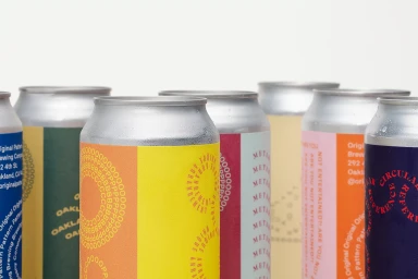
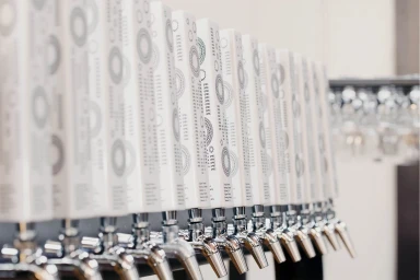
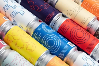
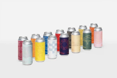
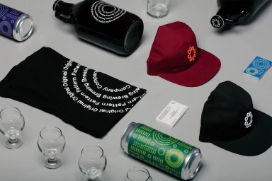
The brand identity for Original Pattern Brewing Company masterfully balances the tactile, refreshing nature of craft beer with a sophisticated, minimalist graphic language. Moving beyond traditional beverage marketing, the project leans into a clean, commercial aesthetic that centers on the brewery's signature circular typography and geometric patterns. Through a series of studio-based product shots and lifestyle imagery, the identity is presented as both precise and approachable. The design execution, spearheaded by Play, utilizes soft light and crisp macro photography to emphasize the vibrant color palettes and matte textures of the packaging. Whether capturing the condensation on a chilled aluminum can or the rhythmic, orderly arrangement of chrome beer taps, the imagery maintains a cohesive visual thread. The inclusion of lifestyle elements, such as the live-action technique shots of a bartender at work, grounds the brand in its Oakland, California roots, bridging the gap between high-end corporate identity and the authentic atmosphere of a craft taproom. By integrating promotional merchandise like apparel alongside core product displays, the project establishes a robust brand ecosystem. Every element, from the professional business cards to the curated glass collections, reinforces a sense of design-led intention, ultimately presenting a modern identity that feels as balanced and thoughtfully crafted as the beer itself.
Horizontal, Commercial, Clean
Advertising Campaign, E-commerce / Product
