
Raycash
Brand Identity
Jul 2026
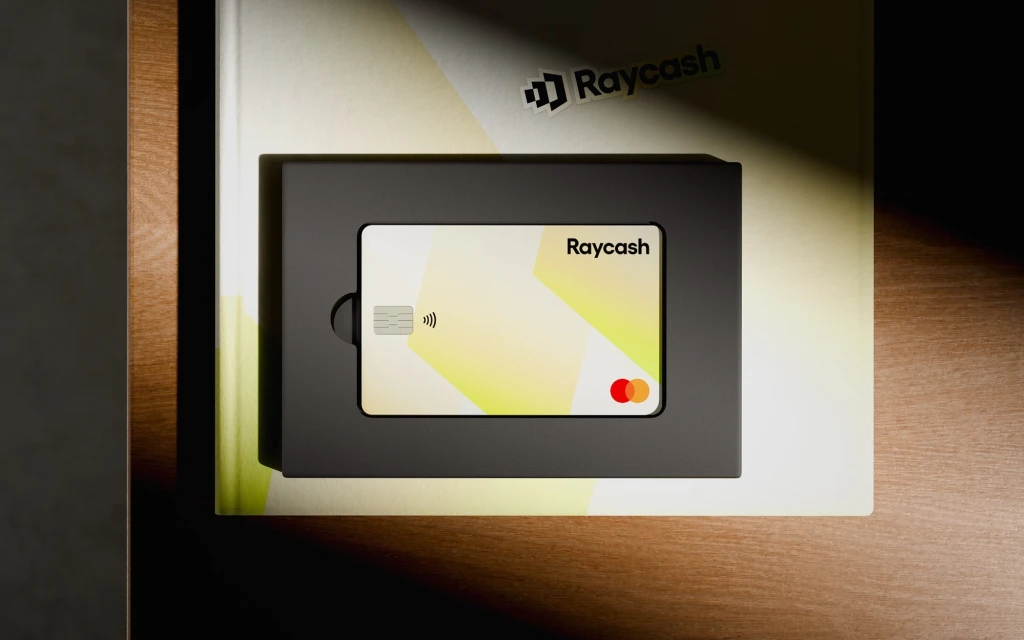
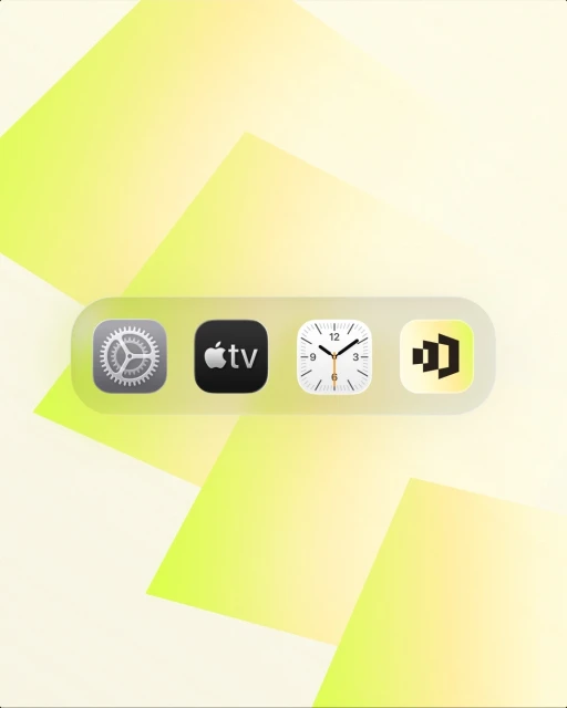
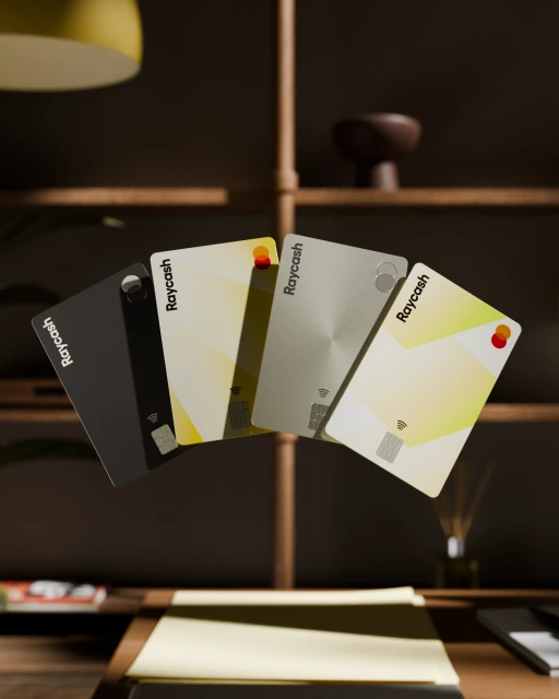
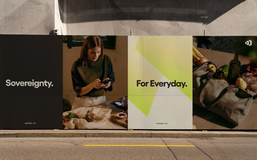
The new brand identity for Raycash marks a decisive shift in the fintech landscape, moving away from sterile corporate tropes to embrace a modern, accessible, and tactile visual language. Crafted by Ashfall Studio, which led the design, motion, and web development, the project creates a cohesive ecosystem that bridges the gap between digital utility and human experience. The design system leverages high-end studio strobe lighting to emphasize the physical quality of the product, particularly through a series of payment cards featuring varied metallic finishes and minimalist geometric gradients. This physicality is mirrored in the digital environment, where UI illustrations utilize frosted glass elements and soft, warm gradients to maintain consistency with the brand's sophisticated palette of matte black and vibrant lime green. The identity truly comes alive in its out-of-home execution, where the brand mantra, Sovereignty for Everyday, anchors a multi-panel billboard campaign that blends high-contrast typography with authentic lifestyle imagery. By balancing these sharp, professional financial aesthetics with the warmth of natural wooden textures and everyday produce, the team has successfully positioned Raycash as an essential part of the modern user's daily life. This is a masterclass in identity design that feels both grounded and aspirational, signaling that the future of finance is as much about human connection as it is about seamless transaction efficiency.
Commercial, Minimalist, Horizontal, Clean
Motion Graphics
Apps & Digital Platforms
Brand Film / Corporate Video
