
Aptos
Brand Identity

Nov 2025
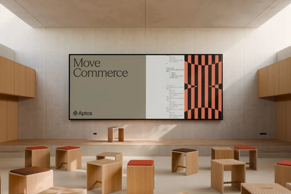
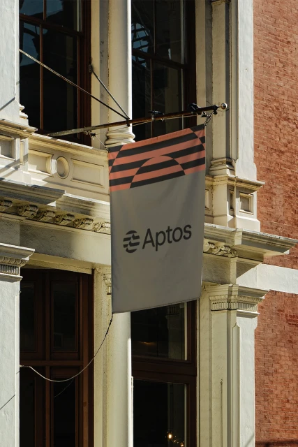
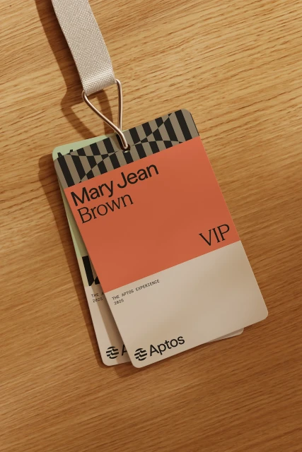
Aptos marks its brand identity project with a focus on structured digital design and developer-centric aesthetics. The visual language leans into a clean, minimalist approach, utilising a palette of muted earth tones and high-contrast typography to communicate across varied platforms. From large-scale architectural billboard installations in urban settings to intricate motion graphic sequences, the project establishes a cohesive ecosystem. The execution integrates vector line animations, responsive UI layouts, and fluid motion graphics, all while highlighting the brand’s core functionality through technical annotations and scrolling code snippets. Ashfall Studio, Evil Martians, and Motto provided the strategy, design, and development to build this comprehensive system.
Horizontal, Commercial, Clean
Motion Graphics
Apps & Digital Platforms
Brand Film / Corporate Video


