
Shelby
Brand Identity
May 2026
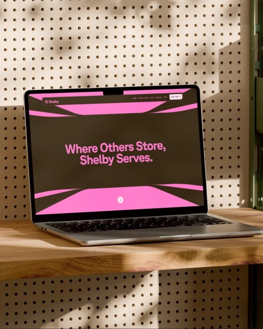
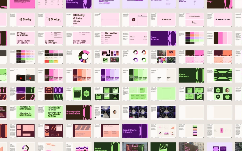
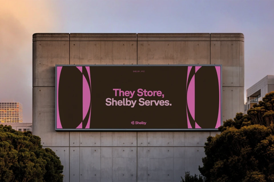
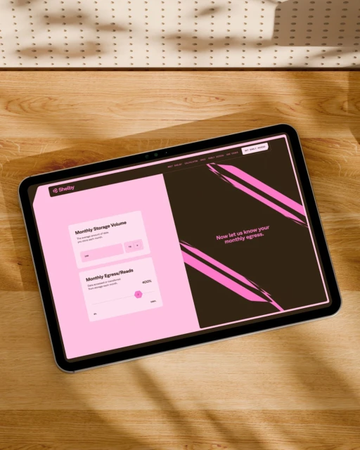
The brand identity overhaul for Shelby marks a masterclass in modern corporate aesthetics, seamlessly blending digital utility with a bold, high-contrast visual language. Spearheaded by the team at Ashfall Studio, the project leans into a sophisticated color palette dominated by vibrant pinks, deep charcoals, and sharp lime green accents, creating a modular design system that feels both playful and remarkably professional. By utilizing typography fonts like GT Planar and Repro Mono, the designers have established a rhythmic, structured hierarchy that translates beautifully across both physical and digital touchpoints. The editorial minimalism inherent in the layout is further elevated by the work of designers Jared Granger and Mubeen Qassim, who ensure every touchpoint—from the high-fidelity UI illustrations on tablet screens to the architectural grandeur of the outdoor billboard—reinforces the brand's core mission: Where Others Store, Shelby Serves. Through a technical marriage of motion design by Dominik Budimir and 3D precision from Kryštof Ježek, the project uses animation to breathe life into the static identity, while web developers Vítor Cardoso, Paul Soulhiard, and Raphael Mendes Bezerra translate these graphic assets into a fluid, highly responsive digital interface. Shot with an emphasis on natural light, the visual presentation frames the brand within real-world workspaces, grounding its abstract, brushstroke-adorned identity in the tangible, high-design environments where its users actually operate.
Horizontal, Clean
Motion Graphics
Apps & Digital Platforms
Solid Colour
Brand Film / Corporate Video


