
Tekuma: Brand Identity
Feb 2026
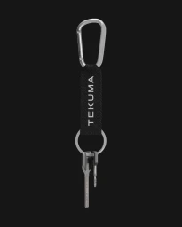
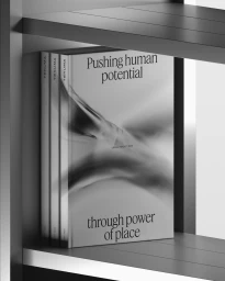
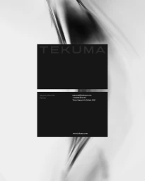
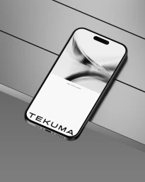
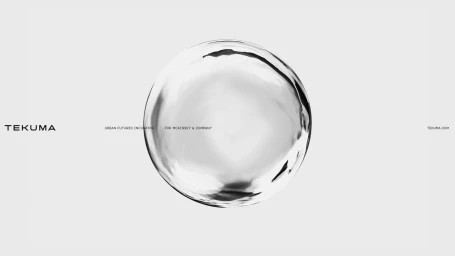
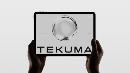
The brand identity for Tekuma, an urban futures incubator, serves as a masterclass in minimalist design and corporate sophistication. Developed by the creative team at Ashfall Studio, with pivotal contributions from designers Mubeen Qassim and Nicolas Garcia, the identity leans into a stark monochrome palette that emphasizes clarity and precision. By blending traditional typography with cutting-edge 3D render and CGI techniques, the visual language moves beyond standard corporate aesthetics to evoke a sense of fluid movement and technological potential. This project masterfully integrates diverse touchpoints, from tactile printed collateral like softcover books and premium keychains to high-fidelity digital interfaces. The use of studio strobe lighting in product photography highlights the tactile quality of the hardware, while dynamic motion and animation elements bring the static brand components to life. With 3D and motion expertise provided by Anoukia Perrey, Kryštof Ježek, Martin Egrt, and Dominik Budimir, the brand architecture achieves a seamless transition between physical and digital spaces. By utilizing abstract, liquid-metallic imagery alongside clean, sans-serif typography, the identity establishes Tekuma as a forward-thinking entity. The result is a cohesive, highly professional brand presence that feels both timeless and deeply embedded in contemporary design trends, effectively bridging the gap between artistic expression and commercial functionality for a global, sophisticated audience.
Clean, Horizontal, Commercial, Minimalist, Monochrome
3D render / CGI


