
Pressed: Brand Identity
Brand
Date
Mar 2022
Description
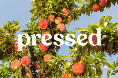
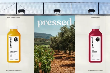
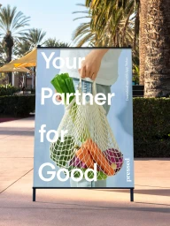
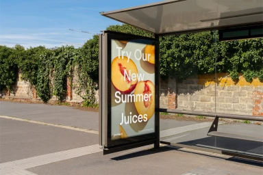
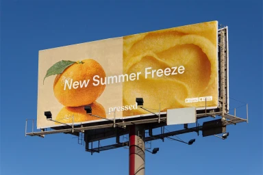
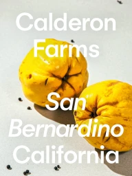
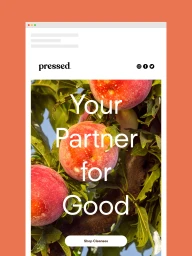
High Tide developed the brand identity for Pressed, spanning across digital interfaces, outdoor advertising, and retail touchpoints. The visual system integrates warm agricultural photography of fresh produce with a clean, minimalist design language that highlights product textures and natural light. Key collateral includes mobile application UI, billboard campaigns featuring orchard-inspired imagery, and outdoor promotional signage. The identity emphasizes a clear, modern typographic treatment that anchors the brand's presence in both physical and digital spaces.
Style
Commercial, Clean
Industries
Associated creatives

5000+ creatives to discover
Sign up to gain access to the entire directory. It’s free.
Visie is a curated library of creative professionals.