
Paco Rabanne
Brand Identity
Jul 2016
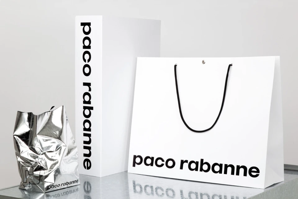
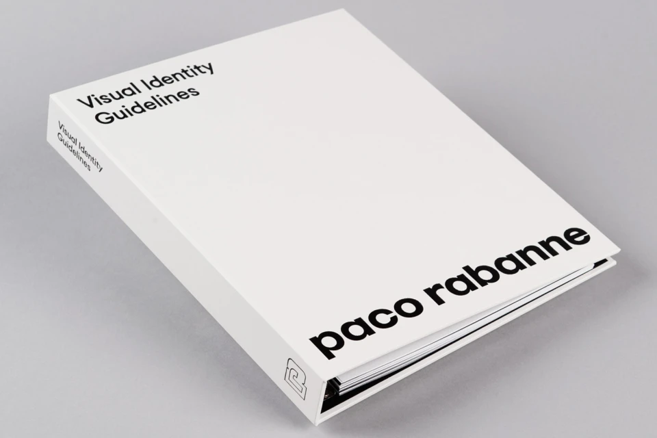
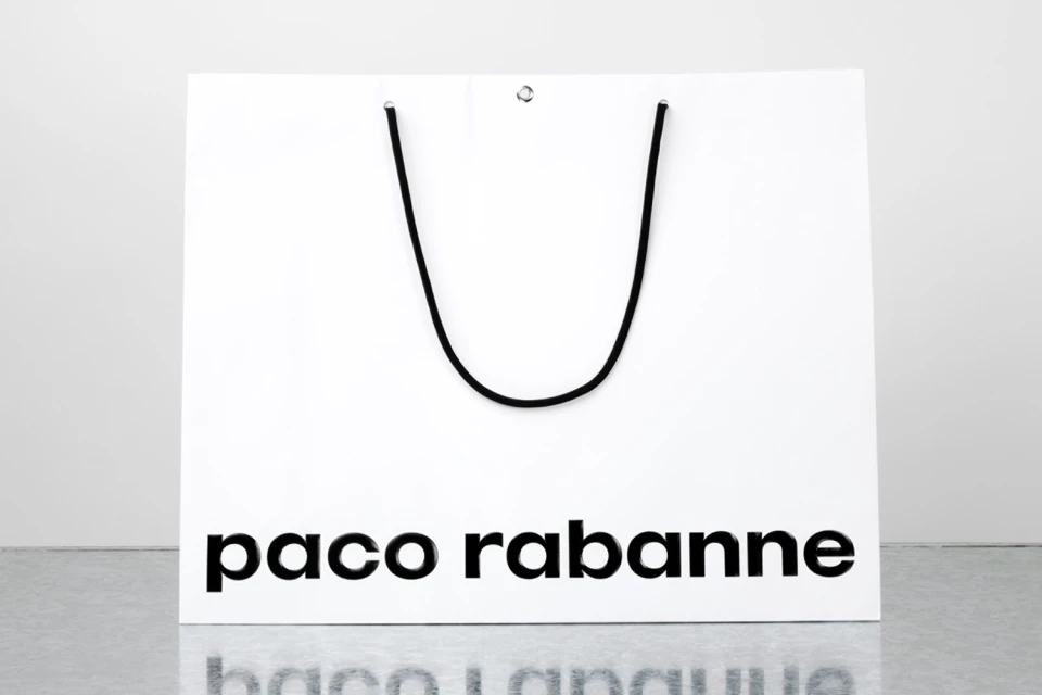
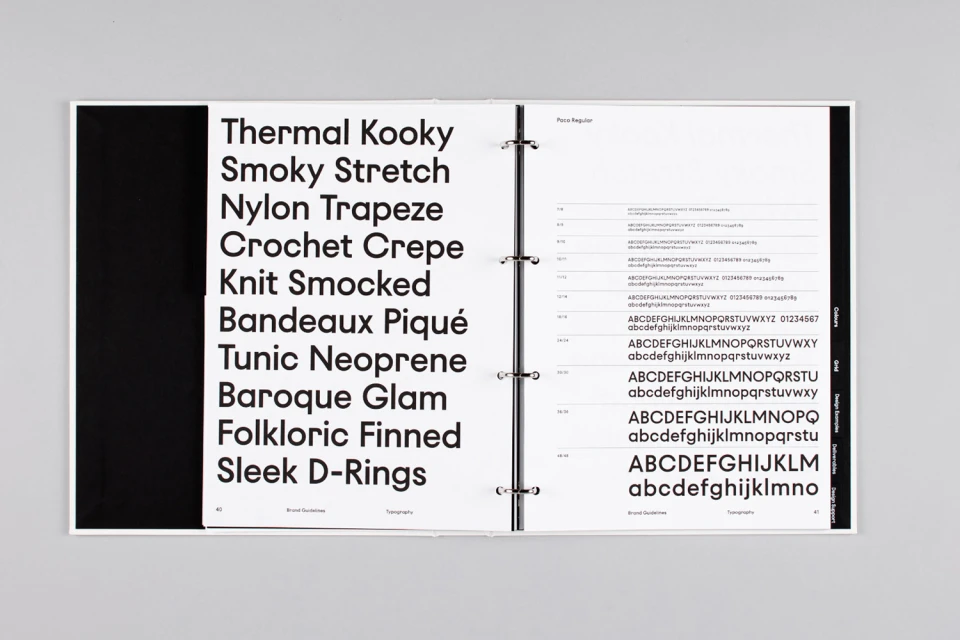
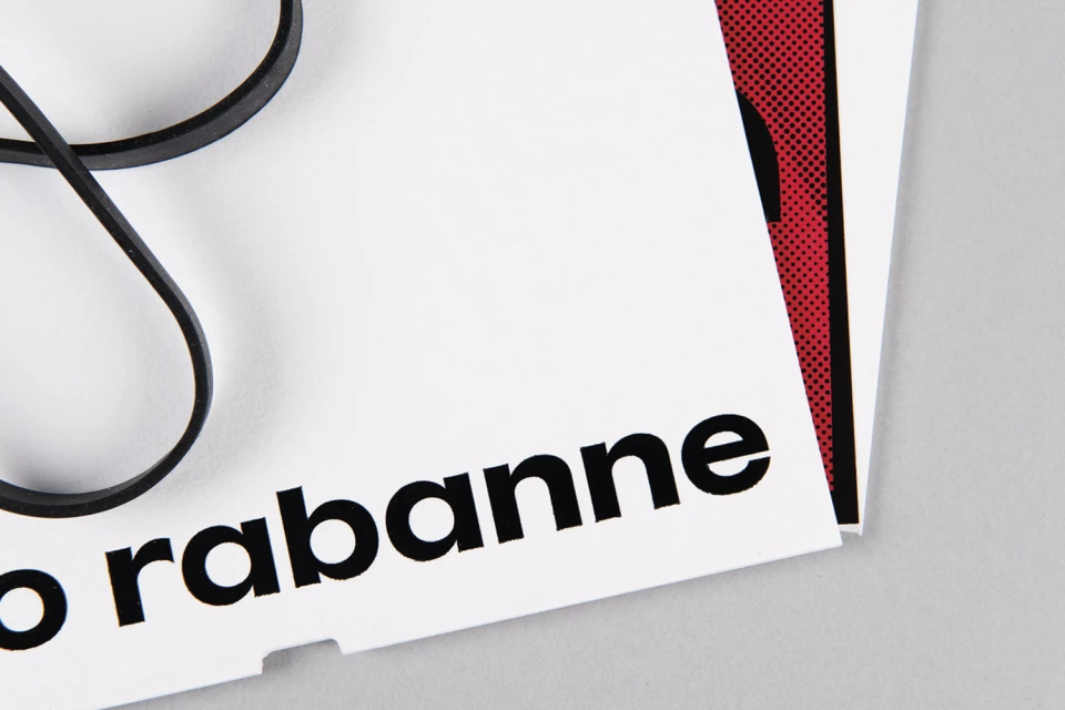
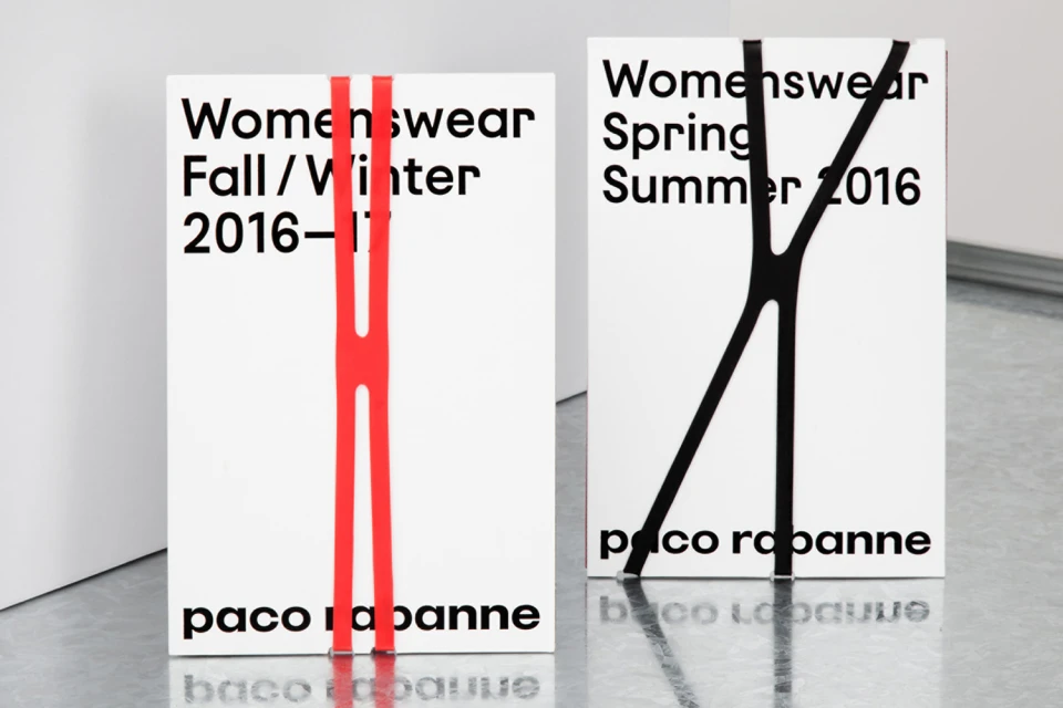
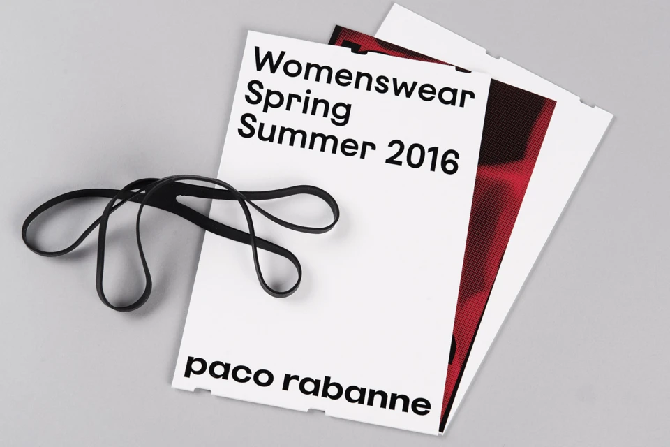
In a masterclass of luxury fashion house branding, the recent visual identity project for Paco Rabanne strips back the ornate to reveal a core of precise, graphic architecture. Crafted with graphic design by Zak Group, the project moves away from fleeting trends, instead leaning into a rigorous, minimalist aesthetic that defines the house through its typography and material contrast. The series of assets employs a clean, high-key studio strobe lighting scheme to emphasize the stark interplay between matte white surfaces and sharp, black sans-serif lettering. By incorporating tactile elements—such as strategically placed black rubber bands and unexpected red halftone patterns—the work creates a tangible, utilitarian dimension within an otherwise corporate framework. From the structured elegance of the visual identity guidelines binder to the carefully considered packaging composition, the project highlights a commitment to institutional consistency. The use of minimalist packaging and bold, legible typography acts as a direct dialogue between the brand's storied history and its modern, sleek iteration. This identity system reads as a deliberate exercise in editorial minimalism, where every element, from the vertical elastic straps on collection booklets to the reflective quality of metallic shopping bags, serves to reinforce the brand's renewed, refined visual language, proving that in the world of high fashion, true luxury is often found in the most disciplined design.
Horizontal, Commercial, Clean, Minimalist
Typography
Luxury Fashion Houses
Grey Seamless
