
Anne Imhof: Brand Identity




Oct 2019
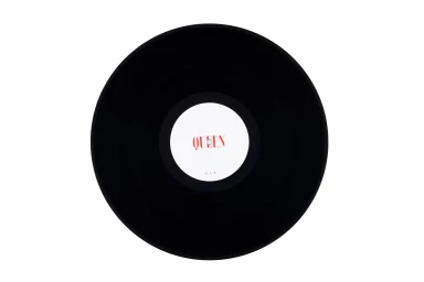
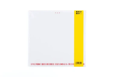
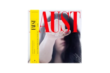
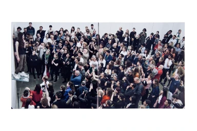
Anne Imhof’s brand identity for this expansive project serves as a masterclass in minimalist editorial design, blending artistic performance with high-end commercial visual language. Across a series of striking compositions, the work utilizes a stark, clinical white backdrop to anchor its subjects, creating a powerful negative space that allows the bold red typography and deliberate geometric elements to cut through the frame with precision. The graphic design, led by Zak Group, emphasizes a high-contrast aesthetic that feels both raw and calculated, channeling an austere energy through deliberate vector typography and rigid, rhythmic layouts. The imagery frequently employs a live-action technique, capturing candid portraits and performative moments that feel caught between a high-fashion editorial spread and a documentary observation of human form. From the symmetrical, tactile focus on vinyl records to the dynamic, split-frame portraiture of performers, the project leans into a cool, cinematic atmosphere defined by soft light and architectural restraint. By juxtaposing everyday athletic wear with clinical studio settings, the branding establishes a distinct, repetitive visual syntax that honors the visceral, confrontational spirit of Imhof’s work. This brand identity effectively bridges the gap between the tactile nature of analogue music media and the ephemeral, documentary reality of performance art, resulting in a cohesive visual system that is as rigorous as it is evocative.
Editorial, Clean, Horizontal
White Seamless
