
BrandPaco Rabanne
ProjectBrand Identity
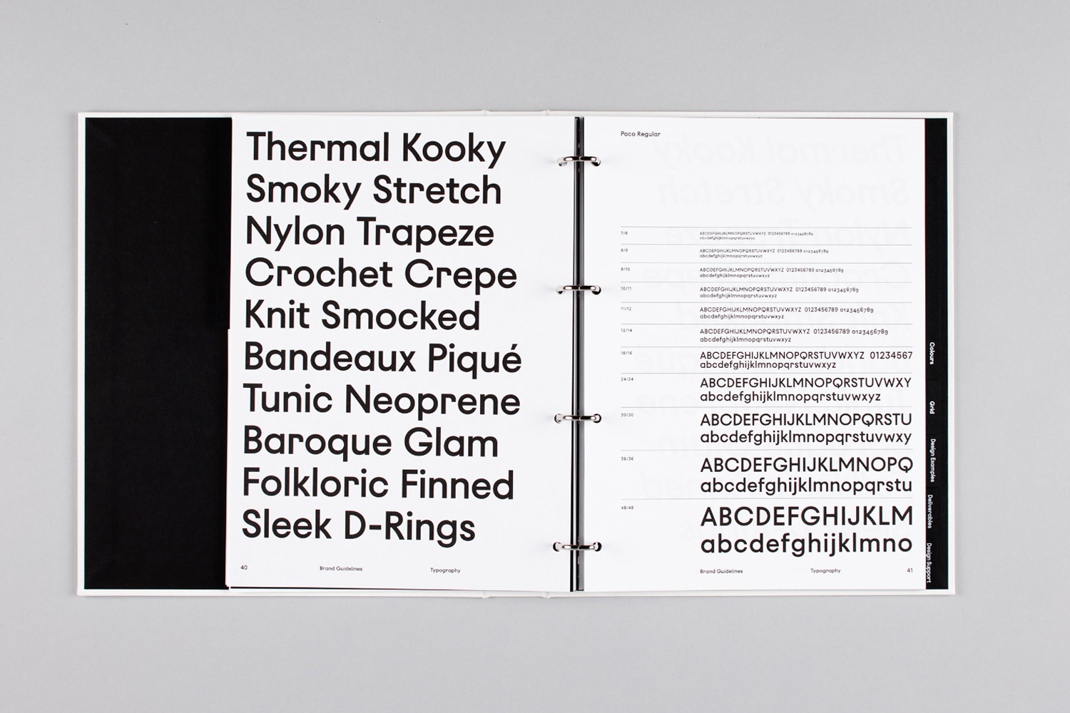
Paco Rabanne Brand Identity 2016
Associated creatives

Tags
Description
An open ring-bound brand identity manual rests flat on a neutral grey surface, displaying typography guidelines for Paco Rabanne designed by Zak Group. The left page features a bold sans-serif headline list with terms like thermal kooky, smoky stretch, and nylon trapeze. The right page displays Paco Regular font scales, glyph sets, and layout grids with clean black and white contrast. Natural lighting illuminates the spread, highlighting the sharp black lettering against crisp white paper stock. The minimalist presentation emphasizes corporate visual identity and graphic design systems.
Style
Horizontal, Corporate, Clean, Minimalist
Techniques
Typography
Industries
Luxury Fashion Houses
Color
Pure White (70%)
Jet Black (30%)
Background
Grey Seamless
Context
Brand Film / Corporate Video