
Ouch: Brand Identity


Brand
Date
Nov 2025
Description
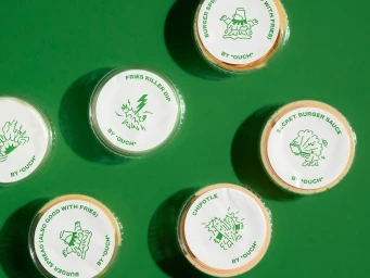
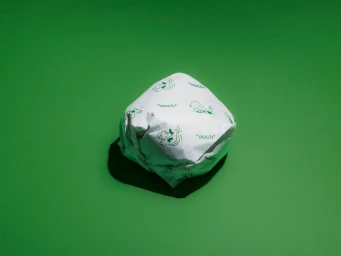
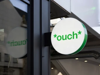
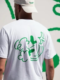
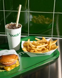
The brand identity for Ouch establishes a high-energy visual system that leans into a monochromatic green and white palette. The project blends clean, minimalist graphic design with playful, character-led illustration to communicate a contemporary fast-food aesthetic. Across the campaign, the work utilises a mix of crisp product photography and dynamic motion graphics. Techniques such as lo-fi, VHS-inspired animation and grainy live-action sequences sit alongside sharp, hard-lit commercial shots to build a cohesive, modern brand presence. Studio Oker provided the graphic design, with illustration by Morten Kantsø and photography by Henriette Heimdal.
Style
Commercial, Clean
Color
Pure White
Forest Green
Associated creatives


5000+ creatives to discover
Sign up to gain access to the entire directory. It’s free.
Visie is a curated library of creative professionals.