
Oobli: Brand Identity
Nov 2023
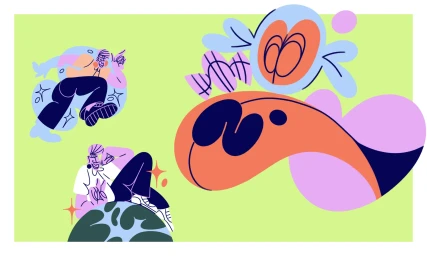
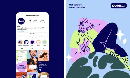
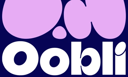
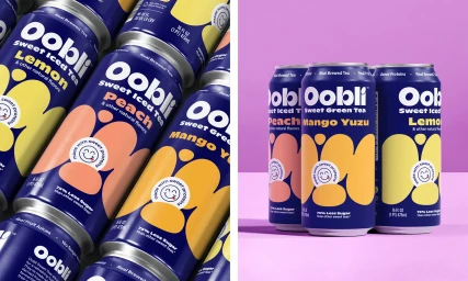
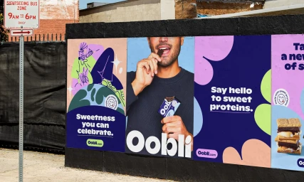
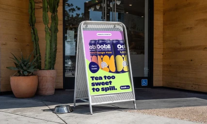
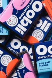
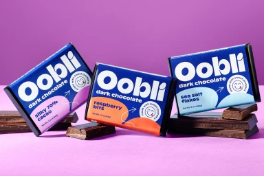
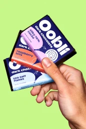
The Oobli brand identity project establishes a vibrant visual system for the CPG brand, spanning digital assets, packaging design, and out-of-home advertising. Developed by Zeus Jones, Dylan Nelson, and Meredith Schomburg, the identity leans into a high-contrast palette of deep blues, purples, and bright greens, set against clean, minimalist layouts. The project utilizes a combination of vector-based graphic illustration and sharp product photography to unify the brand across multiple formats. Creative elements include dynamic motion graphics, mobile interface mockups, and bold typography that anchors the brand's presence in both retail and urban environments. Whether applied to aluminium beverage cans or chocolate bar packaging, the visual language prioritizes clear hierarchy and playful, abstract organic shapes. Photography by Dylan Nelson and illustration by Meredith Schomburg work in concert with graphic design by Zeus Jones to maintain a consistent, modern aesthetic throughout the Oobli product range.
Horizontal, Clean, Commercial, Graphic


