
Netflix: Brand Identity
Mar 2023
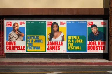
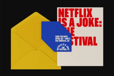
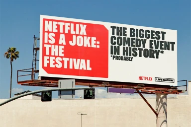
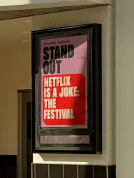
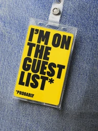
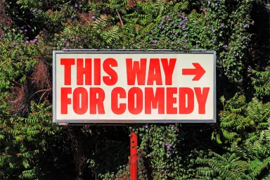
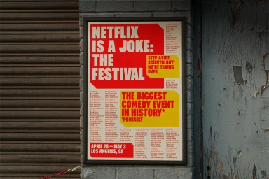
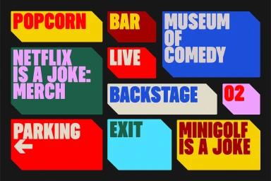
Netflix developed a comprehensive brand identity system for its 'Netflix Is A Joke' comedy festival, characterized by a high-contrast graphic design language. The visual identity leverages a vibrant primary color palette of red, yellow, blue, and green, paired with clean, bold typography to establish a distinct festival presence across both digital and physical touchpoints. The project features an extensive suite of collateral, ranging from large-scale outdoor billboards and signage to tactile event ephemera like ID badges and custom ticket-shaped badges. By utilizing a minimalist, vector-inspired aesthetic, the work maintains visual clarity through clear hierarchies and sharp typographic alignments. Graphic design was led by PORTO ROCHA. The project's urban presence and campaign materials were documented through photography by Allison Zaucha and Erik Undéhn.
Horizontal, Commercial, Clean
Typography, Natural light
Out of Home (OOH)


