
Motorcycle Matcha: Brand Identity
Dec 2024
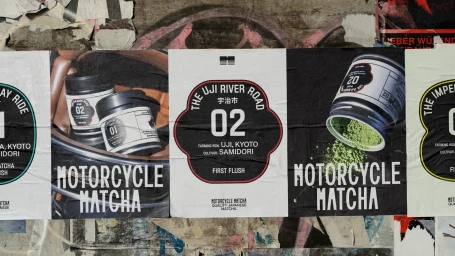
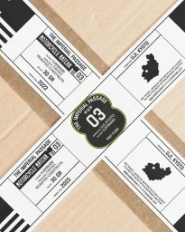
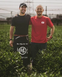
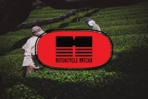
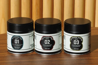
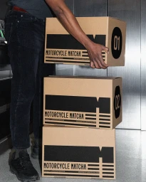
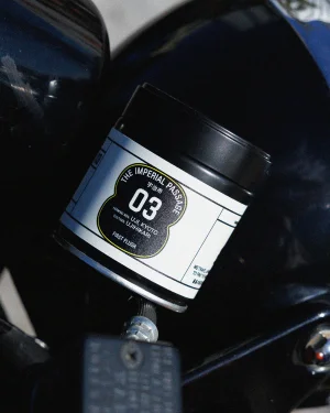
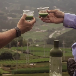
Motorcycle Matcha establishes a distinct brand identity for the beverage company, bridging traditional agricultural roots with a modern, minimalist visual language. Developed by Saint-Urbain, the project employs bold typography and geometric emblems to communicate the specific origins, cultivars, and quality markers of its matcha products. The design system utilizes a palette of stark black, white, and earthy tones to maintain a clean, premium aesthetic across packaging and marketing assets. Photography by Alex Stein and motion design by Gur Margalit and Oli Sabin expand the brand’s narrative through a mix of gritty street-level application and editorial field reportage. The identity frequently leans into natural textures, juxtaposing raw agricultural landscapes with sharp graphic layouts. By integrating drone footage, animation, and tactile packaging photography, the project presents a unified identity that feels both grounded in tea culture and contemporary in its execution.
Commercial, Clean, Vertical


