
Associated creatives

Tags
Description
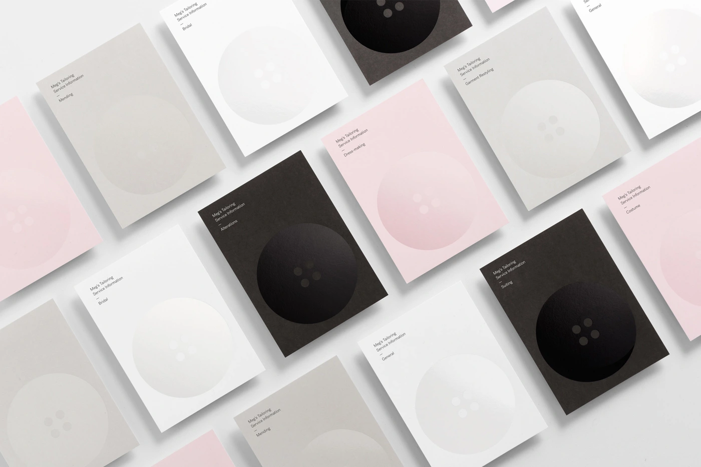
This flat lay composition showcases a brand identity project for Megs Tailoring designed by Studio South. Multiple rectangular stationery cards are arranged in an orderly diagonal grid across a clean white surface. Each card features minimalist typography alongside a prominent, subtly embossed circular button graphic. The restrained colour palette spans soft pinks, warm greys, crisp whites, and deep charcoals, establishing an elegant and tactile visual language for the tailoring service.