
BrandMeg's Tailoring
ProjectBrand Identity
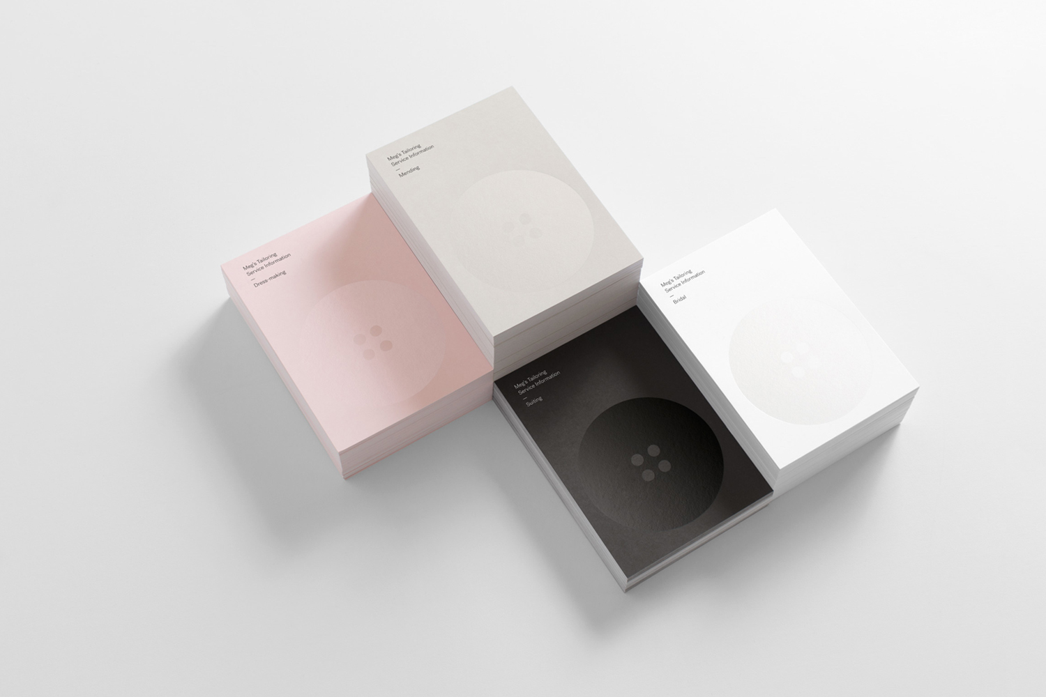
Meg's Tailoring Brand Identity 2016
Associated creatives

Tags
Description
This brand identity project for Meg's Tailoring showcases four distinct stacks of business cards arranged neatly on a clean white surface. The cards feature minimal typography and a subtle embossed button motif, rendered in shades of pink, beige, white, and black. Designed by Studio South, the clean layout highlights the tactile qualities of the paper stock and the refined typography. Soft lighting casts gentle shadows beneath each stack, adding depth and dimension to the flat lay composition.
Style
Horizontal, Commercial, Clean, Minimalist
Techniques
Emboss & Deboss
Color
Pure White (30%)
Jet Black (30%)
Blush (40%)
Background
White Seamless
Context
Advertising Campaign